
Welcome to the fifth part of our Matplotlib blog series, where we transcend the ordinary and delve into the realm of advanced customization and styling in our “Advanced Customization and Styling Using Matplotlib”. In this chapter, we embark on a journey beyond the basics, exploring techniques that elevate the visual aesthetics of your plots.
As seasoned data visualizers, we understand that the story lies not only in the data but also in how it’s presented. From crafting custom color maps that breathe life into your visual narratives to adding images and annotations that speak volumes, we’re here to guide you through the intricacies of advanced styling.
Lets start our journey into the realm “Advanced Customization and Styling Using Matplotlib”, by Disecting the significance of these vibrant palettes and their pivotal role in visualizing data.
In the vivid canvas of data visualization, a color map is a carefully curated palette that assigns colors to numerical values. It acts as the artist’s palette, translating data into a spectrum of hues that engage the viewer. With Matplotlib, color maps are the brushstrokes that bring visual narratives to life.
Why does the choice of a color map matter? Imagine conveying temperature variations, financial trends, or geographical elevations—all through the language of color. A well-selected color map not only adds aesthetic appeal but also enhances the interpretability of your data.
The world of data is diverse, and so are the stories it tells. Choosing the right color map becomes paramount. A sequential color map may befit a gradual progression, while a diverging map might accentuate positive and negative deviations. Understanding the nature of your data is key to ensuring that the color map echoes the nuances of your narrative.
In the upcoming segments, we’ll delve into the art of crafting custom color maps, unlocking the palette to weave compelling visual stories. Join us as we paint with data, one color map at a time.
Now that we’ve laid the foundation of understanding color maps, it’s time to wield your artistic brush and create custom palettes that resonate with your data’s melody. In this section, we’ll embark on a step-by-step guide to crafting bespoke color maps in Matplotlib in our Advanced Customization and Styling Using Matplotlib, allowing you to infuse your visualizations with a unique, tailored aesthetic.
Let’s dive into the process of crafting your custom color map. Matplotlib provides a canvas on which you can blend colors seamlessly. Follow these steps to bring your palette to life:
Define Color Points:
Specify Colors:
Create Listed Color Map:
Apply to Your Plot:
Example:
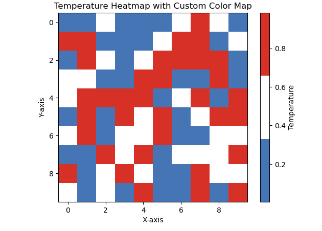
Let’s create a Python code snippet for crafting a custom color map and applying it to a simple heatmap. In this example, we’ll visualize temperature variations using a color map that smoothly transitions from cool to warm hues.
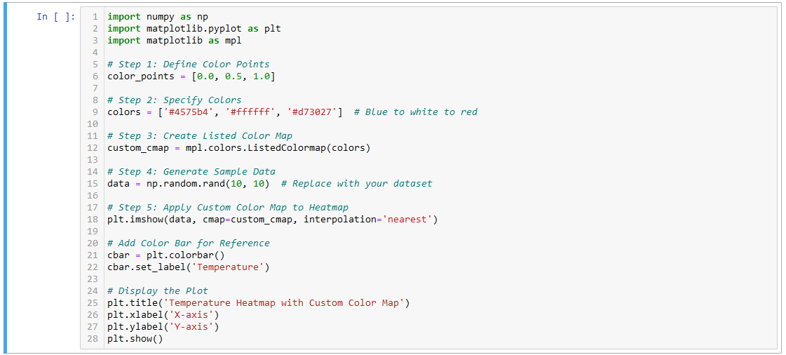
Defining Color Points and Colors:
Creating Listed Color Map:
Generating Sample Data:
Applying Custom Color Map to Heatmap:
Adding Color Bar:
Displaying the Plot:
Feel free to experiment with different color points, colors, and datasets to tailor the color map to your specific visualization needs.
Now that you’ve mastered the art of crafting custom color maps, it’s time to turn our attention to color bars—a key element in your visual storytelling toolkit. In this section of our Advanced Customization and Styling Using Matplotlib, we’ll unravel the purpose of color bars in conveying the scale of your data and guide you through techniques to customize and enhance them for more effective visualization.
Color bars are not mere adornments; they are interpreters of your visual symphony. Their primary purpose is to provide a visual reference for the scale of your data. As colors dance across your plot, the color bar serves as a legend, decoding the numeric values associated with each hue. Whether you’re mapping temperatures, elevations, or any continuous variable, the color bar is the guide that transforms colors into meaningful insights.
To master color bars, let’s explore techniques for customization, ensuring they seamlessly integrate with your plot:
Size and Placement:
Labeling:
Ticks and Tick Labels:
Color Map Alignment:
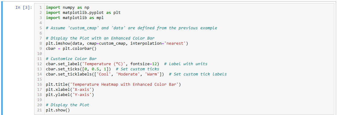
In this demonstration, we’ve customized the color bar to include a descriptive label, set custom ticks, and provided meaningful tick labels. Experiment with these techniques to master the art of conveying data scale through your color bars.
In the expansive canvas of data visualization, images are potent storytellers, capable of adding depth and context to your plots. In this section of our Advanced Customization and Styling Using Matplotlib blog, we’ll embark on a guided journey to seamlessly integrate external images into Matplotlib plots. As we explore various scenarios, you’ll discover how these images become integral components, enhancing plot context and weaving richer narratives.
Let’s embark on a step-by-step guide to effortlessly weave external images into your Matplotlib plots.
Import Necessary Libraries:
Load and Display External Image:
mpimg.imread() function to load your external image. Display it within the plot using plt.imshow().Positioning and Scaling:
extent parameter allows precise control over placement.Let’s delve into a practical example where integrating an image enhances the plot context.

In this example, the logo image is seamlessly integrated into the plot, adding a distinctive touch to the visualization.
As you embark on your own image integration adventures, remember that each image holds the potential to transform your plots into compelling visual narratives. Experiment, explore, and let your data stories come to life with the added dimension of images.
Annotations, the storytellers of your plot, possess the unique power to emphasize key data points and guide the viewer’s focus. In this section of our Advanced Customization and Styling Using Matplotlib, we’ll unveil the art of annotations, showcasing their capability to communicate insights effectively. Through examples of text and arrow annotations, you’ll learn how to wield this visual tool for compelling and precise storytelling.
Annotations serve as signposts, directing the viewer’s attention to critical elements within your plot. Let’s explore how to wield this power effectively:
Text Annotations: Adding Contextual Clarity
Arrow Annotations: Guiding the Viewer’s Gaze
Let’s dive into practical examples where annotations elevate the plot:
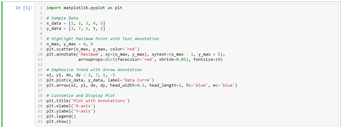
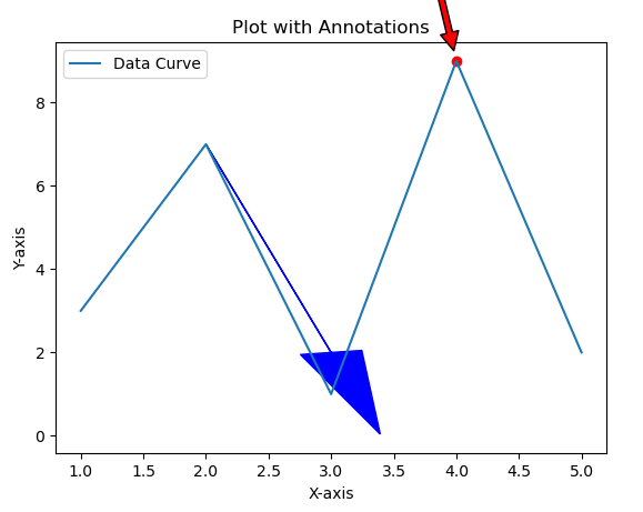
In this example, we annotate the maximum point on the plot and emphasize a directional trend using both text and arrow annotations.
Annotations are not just embellishments; they are strategic elements that guide your audience through the data narrative. Mastering this art allows you to communicate insights with precision and impact. Experiment with annotations to discover how they can enhance the clarity and visual appeal of your plots.
In the realm of data exploration, static plots, while informative, sometimes fall short in capturing the dynamic essence of your datasets. Enter interactive plots—a gateway to a dynamic and immersive data exploration experience. In this section of our Advanced Customization and Styling Using Matplotlib, we’ll introduce the concept of interactive plots, unraveling their potential for dynamic data exploration, particularly within the versatile environment of Jupyter notebooks.
Interactive plots transcend the boundaries of traditional static visuals. They empower users to dynamically engage with data, enabling real-time exploration and analysis. With interactive plots, the viewer becomes an active participant, steering the narrative, zooming into details, and extracting insights tailored to their curiosity.
Real-Time Exploration:
On-the-Fly Customization:
Data Point Inspection:
Seamless Integration with Jupyter Notebooks:

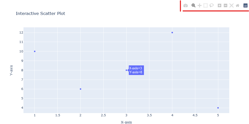
In this example, the Plotly library is used to create an interactive scatter plot within a Jupyter notebook. Hover over points, pan, and zoom to witness the dynamic nature of interactive plots.
As you explore interactive plots in Jupyter, remember that the journey is not about static snapshots; it’s about dynamic conversations with your data. The notebook becomes a canvas where insights unfold interactively, revealing nuances that static plots might keep hidden. Experiment, interact, and let your data narratives come alive in the world of Jupyter notebooks.
Enter the realm of widget magic, where your Matplotlib plots become dynamic canvases, responding to the whims of user interaction. In this section of our Advanced Customization and Styling Using Matplotlib blog, we’ll embark on a tutorial that demystifies the enchanting world of Matplotlib widgets. From sliders to buttons, witness the transformation of static plots into interactive masterpieces, allowing real-time data manipulation and exploration.
Matplotlib widgets are the sorcerers’ tools that empower you to breathe life into your plots. Let’s delve into a step-by-step tutorial on using these widgets to create interactive elements within your plots:
Import Necessary Libraries:
Create a Simple Plot:
Define Widgets:
Define Callback Functions:
Display the Plot:
Let’s put our newfound knowledge into action with a visual showcase. In this example, we’ll use a slider to dynamically adjust the transparency of a plot element:
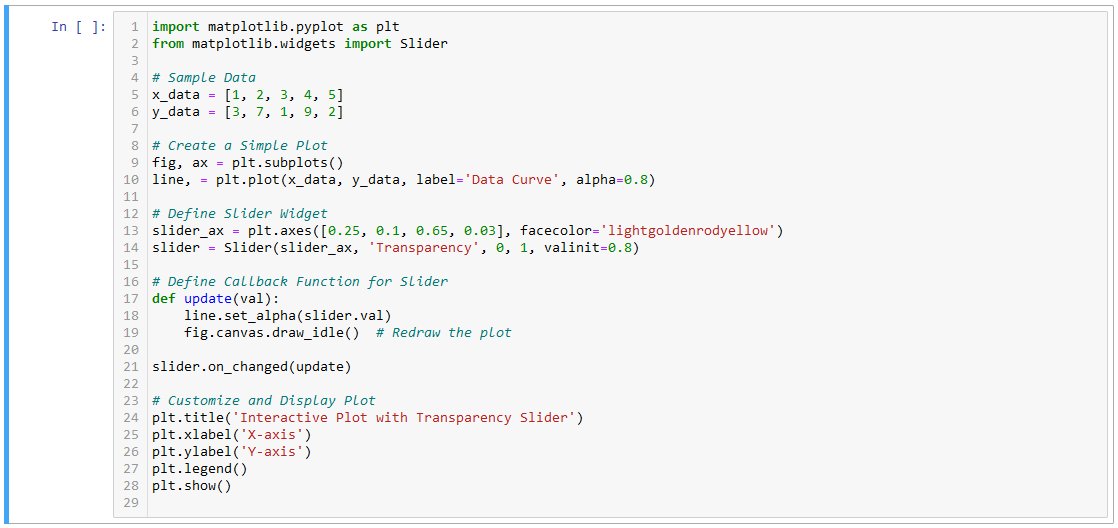
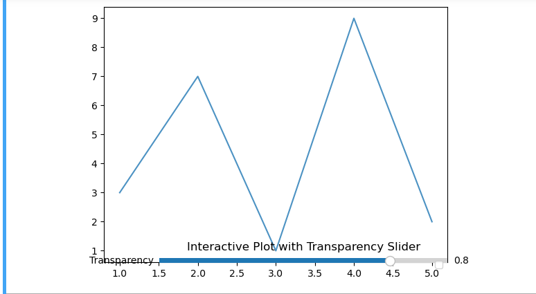
In this example, the transparency of the data curve is dynamically adjusted using a slider. Witness the magic unfold as you interact with the slider, seamlessly altering the plot’s visual appearance in real time.
As you experiment with Matplotlib widgets, remember that each widget introduces a unique dimension of interactivity to your plots. Whether sliders, buttons, or any other wizardry, let your creativity guide you in creating plots that respond and adapt to user interactions in real time.
In the expansive landscape of Matplotlib mastery, this blog, “Advanced Customization and Styling Using Matplotlib”, has been your guide through the diverse realms of customization, interactivity, and integration. As you embark on the concluding chapter of our exploration, reflect on the skills you’ve acquired and the doors you’ve opened in the world of Pythonic data visualization.
As you conclude this chapter of the Matplotlib saga, remember that your journey doesn’t end here—it evolves. The canvas is vast, and Matplotlib invites you to paint your data narratives with creativity and precision. Explore advanced techniques, experiment with complex visualizations, and push the boundaries of what Matplotlib can achieve. If you enjoyed the blog follow 1stepgrow.
We provide online certification in Data Science and AI, Digital Marketing, Data Analytics with a job guarantee program. For more information, contact us today!
Courses
1stepGrow
Anaconda | Jupyter Notebook | Git & GitHub (Version Control Systems) | Python Programming Language | R Programming Langauage | Linear Algebra & Statistics | ANOVA | Hypothesis Testing | Machine Learning | Data Cleaning | Data Wrangling | Feature Engineering | Exploratory Data Analytics (EDA) | ML Algorithms | Linear Regression | Logistic Regression | Decision Tree | Random Forest | Bagging & Boosting | PCA | SVM | Time Series Analysis | Natural Language Processing (NLP) | NLTK | Deep Learning | Neural Networks | Computer Vision | Reinforcement Learning | ANN | CNN | RNN | LSTM | Facebook Prophet | SQL | MongoDB | Advance Excel for Data Science | BI Tools | Tableau | Power BI | Big Data | Hadoop | Apache Spark | Azure Datalake | Cloud Deployment | AWS | GCP | AGILE & SCRUM | Data Science Capstone Projects | ML Capstone Projects | AI Capstone Projects | Domain Training | Business Analytics
WordPress | Elementor | On-Page SEO | Off-Page SEO | Technical SEO | Content SEO | SEM | PPC | Social Media Marketing | Email Marketing | Inbound Marketing | Web Analytics | Facebook Marketing | Mobile App Marketing | Content Marketing | YouTube Marketing | Google My Business (GMB) | CRM | Affiliate Marketing | Influencer Marketing | WordPress Website Development | AI in Digital Marketing | Portfolio Creation for Digital Marketing profile | Digital Marketing Capstone Projects
Jupyter Notebook | Git & GitHub | Python | Linear Algebra & Statistics | ANOVA | Hypothesis Testing | Machine Learning | Data Cleaning | Data Wrangling | Feature Engineering | Exploratory Data Analytics (EDA) | ML Algorithms | Linear Regression | Logistic Regression | Decision Tree | Random Forest | Bagging & Boosting | PCA | SVM | Time Series Analysis | Natural Language Processing (NLP) | NLTK | SQL | MongoDB | Advance Excel for Data Science | Alteryx | BI Tools | Tableau | Power BI | Big Data | Hadoop | Apache Spark | Azure Datalake | Cloud Deployment | AWS | GCP | AGILE & SCRUM | Data Analytics Capstone Projects
Anjanapura | Arekere | Basavanagudi | Basaveshwara Nagar | Begur | Bellandur | Bommanahalli | Bommasandra | BTM Layout | CV Raman Nagar | Electronic City | Girinagar | Gottigere | Hebbal | Hoodi | HSR Layout | Hulimavu | Indira Nagar | Jalahalli | Jayanagar | J. P. Nagar | Kamakshipalya | Kalyan Nagar | Kammanahalli | Kengeri | Koramangala | Kothnur | Krishnarajapuram | Kumaraswamy Layout | Lingarajapuram | Mahadevapura | Mahalakshmi Layout | Malleshwaram | Marathahalli | Mathikere | Nagarbhavi | Nandini Layout | Nayandahalli | Padmanabhanagar | Peenya | Pete Area | Rajaji Nagar | Rajarajeshwari Nagar | Ramamurthy Nagar | R. T. Nagar | Sadashivanagar | Seshadripuram | Shivajinagar | Ulsoor | Uttarahalli | Varthur | Vasanth Nagar | Vidyaranyapura | Vijayanagar | White Field | Yelahanka | Yeshwanthpur
Mumbai | Pune | Nagpur | Delhi | Gurugram | Chennai | Hyderabad | Coimbatore | Bhubaneswar | Kolkata | Indore | Jaipur and More