Welcome to the second act of our Plotly blog series, “Advanced Visualizations with Plotly” where we plunge into the captivating realm of data visualization with greater depth and finesse. In this segment, we embark on a journey to elevate our skills, delving into advanced topics that promise to magnify the resonance of your visual narratives. Get ready to harness the full spectrum of Plotly’s magic as we unveil intricate techniques and unveil the true artistry in transforming data into compelling stories. Let the curtain rise on a stage where visualization meets mastery, and where your data stories evolve into impactful experiences.
In this section of our Advanced Visualizations with Plotly, we unveil the power and versatility of Plotly Express in crafting nuanced visualizations that go beyond the basics. From revealing statistical distributions with Box Plots to visualizing temporal data with Gantt Charts, each plot brings a unique perspective to your data narratives. Join us in this exploration of advanced plots, where customization meets precision, and data unfolds into a compelling visual story. Let’s dive into the world of Box Plots, Violin Plots, Gantt Charts, Contour Plots, Heatmaps, and Error Bars to elevate your visualization expertise.
In the realm of data visualization, Box Plots stand as versatile tools, offering a snapshot of the distribution, central tendency, and potential outliers within a dataset. The simplicity and clarity of Box Plots make them invaluable for interpreting data variability. In this section, we embark on a journey to comprehend, create, customize Box Plots with Plotly Express, and understand how to read them effectively.
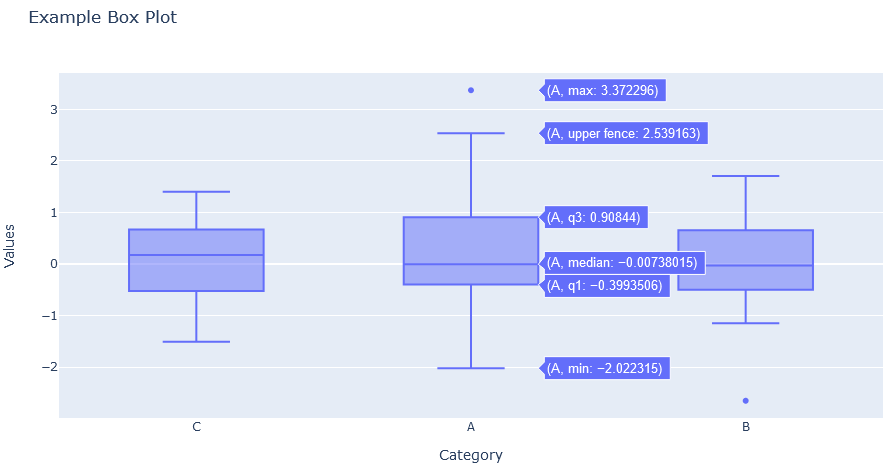
Let’s kick off our exploration by mastering the art of creating Box Plots using Plotly Express which comes under the Advanced Visualizations with Plotly. With just a few lines of code, you can generate insightful visualizations that encapsulate the statistical characteristics of your data. Here’s a quick example:

Importing Libraries:
import plotly.express as px: Importing Plotly Express for creating interactive visualizations.import pandas as pd: Importing Pandas for creating and manipulating DataFrames.import numpy as np: Importing NumPy for generating random data.Creating a Sample DataFrame:
df) with two columns – ‘Category’ and ‘Values’. ‘Category’ consists of random choices from [‘A’, ‘B’, ‘C’], and ‘Values’ contains random numbers drawn from a normal distribution.Creating a Box Plot:
px.box(x='Category', y='Values', data_frame=df, title='Example Box Plot'): Using Plotly Express, we create a Box Plot. The ‘Category’ column is assigned to the x-axis, ‘Values’ to the y-axis, and the DataFrame is specified as data_frame. The title of the plot is set to ‘Example Box Plot’.Displaying the Box Plot:
box_plot.show(): This command displays the Box Plot.Run this code in a Jupyter Notebook or a Python script, and you’ll see an interactive Box Plot visualizing the distribution of ‘Values’ across different ‘Categories’ in your sample dataset.
Understanding how to interpret Box Plots is crucial for extracting meaningful insights. Here’s a breakdown of key components:
Box (IQR): The box represents the interquartile range (IQR), the middle 50% of the data. The bottom and top edges of the box mark the first and third quartiles (Q1 and Q3).
Median (Q2): The line inside the box denotes the median, representing the middle point of the data.
Whiskers: The whiskers extend from the box to the minimum and maximum values within a certain range. Outliers, points beyond this range, are often shown as individual points.
Outliers: Data points beyond the whiskers are considered potential outliers. They can provide insights into extreme values within the dataset.
The power of customization lies in your hands with the Advanced Visualizations with Plotly. Tailor your Box Plots to convey information with precision and style. Here are some customization options:

In this snippet, we’ve customized the marker color, line color, and displayed standard deviation on the Box Plot. Experiment with these parameters to match your visualization preferences.
Box Plots find applications in diverse scenarios. From comparing distributions across categories to identifying potential outliers, their versatility is unmatched. Let’s explore some use cases:
Comparing Sales Across Regions: Analyze sales data with Box Plots to compare the distribution of revenue across different regions, identifying variations and potential outliers.
Monitoring Test Scores: In educational settings, Box Plots help visualize the distribution of test scores, revealing the central tendency and spread among students.
Detecting Anomalies in Time-Series Data: When dealing with time-series data, Box Plots become handy in spotting anomalies or shifts in the distribution over time.
As you integrate Box Plots into your Advanced Visualizations with Plotly toolkit, consider best practices such as choosing appropriate box widths, clearly labeling axes, and providing context through titles and annotations. These practices enhance the interpretability of your visualizations and empower you to extract meaningful insights from your data.
Venture into the realm of Violin Plots, a powerful visualization tool that combines the features of box plots and kernel density plots. Violin Plots offer a nuanced view of data distributions, making them invaluable for understanding the spread and density of your datasets. In this section, we will explore the fundamentals of Violin Plots using Plotly Express, delve into customization techniques, and unveil real-world applications.
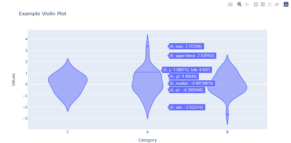
Let’s kickstart our exploration by mastering the art of generating Violin Plots using Plotly Express. With just a few lines of code, you can reveal the shape and density of your data. Here’s a detailed example:

Importing Libraries:
import plotly.express as px: Importing Plotly Express for creating interactive visualizations.import pandas as pd: Importing Pandas for creating and manipulating DataFrames.import numpy as np: Importing NumPy for generating random data.Creating a Sample DataFrame:
df) with two columns – ‘Category’ and ‘Values’. ‘Category’ consists of random choices from [‘A’, ‘B’, ‘C’], and ‘Values’ contains random numbers drawn from a normal distribution.Generating a Violin Plot:
px.violin(x='Category', y='Values', data_frame=df, title='Example Violin Plot'): Creating a Violin Plot with Plotly Express. ‘Category’ is assigned to the x-axis, ‘Values’ to the y-axis, and the DataFrame is specified as data_frame. The title of the plot is set to ‘Example Violin Plot’.Displaying the Violin Plot:
violin_plot.show(): Displaying the Violin Plot.Enhance the expressiveness of your Violin Plots with customization. Modify aspects such as colors, markers, and violin width to suit your visualization preferences. For instance:

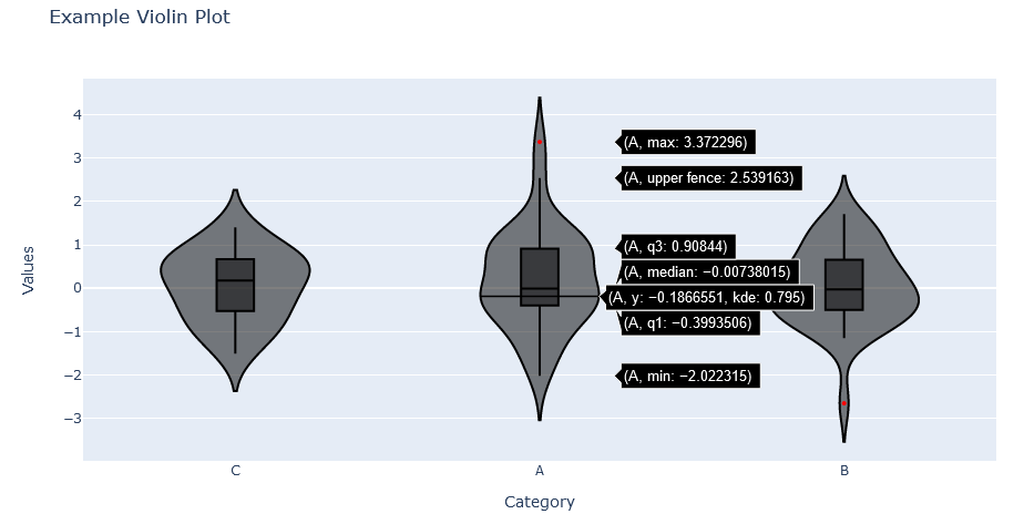
Experiment with these parameters to refine the visual impact of your Violin Plots.
Understanding Violin Plots involves decoding the following elements:
Width of the Violin: The width at any given point represents the density of data at that specific value.
Central White Dot: Similar to the median in a box plot, the white dot signifies the median of the data.
Interquartile Range (IQR): The thick part of the plot represents the IQR, indicating the central 50% of the data.
Violin Shape: The shape of the violin reflects the distribution of the data. Wider sections indicate higher data density.
Violin Plots find application in diverse scenarios in Advanced Visualizations with Plotly. Here are some use cases:
Comparing Distributions: Use Violin Plots to compare the distributions of different categories in your dataset, revealing variations and patterns.
Visualizing Density: Violin Plots excel in visualizing data density, providing a comprehensive view of the spread and concentration of values.
Identifying Outliers: Detect potential outliers by inspecting the width and shape variations in Violin Plots.
Dive into the world of Gantt Charts, a powerful visualization tool designed for displaying project timelines and tasks. Gantt Charts offer a clear and intuitive representation of project schedules, making them indispensable for project managers and teams. In this section, we will explore the foundations of Gantt Charts, demonstrate how to construct them using Plotly Express, delve into advanced customization options, and unveil real-world applications.
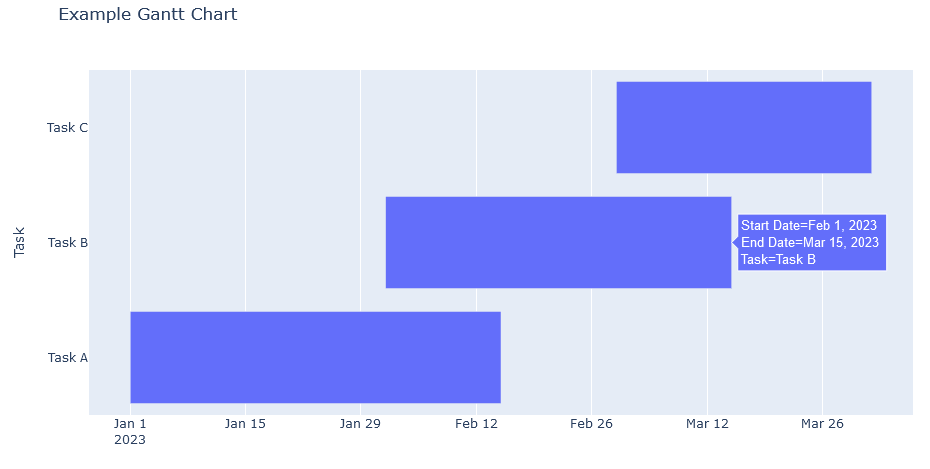
Let’s embark on the journey of creating Gantt Charts using Plotly Express. These charts efficiently showcase project timelines, highlighting task durations and dependencies. Here’s an illustrative example:

Importing Libraries:
import plotly.express as px: Importing Plotly Express for creating interactive visualizations.import pandas as pd: Importing Pandas for creating and manipulating DataFrames.Creating a Sample DataFrame for Gantt Chart:
df_gantt) with columns such as ‘Task’, ‘Start Date’, and ‘End Date’ to simulate tasks and their respective timelines.Constructing a Gantt Chart:
px.timeline(df_gantt, x_start='Start Date', x_end='End Date', y='Task', title='Example Gantt Chart'): Using Plotly Express, we construct a Gantt Chart. ‘Start Date’ and ‘End Date’ define the duration of tasks, ‘Task’ represents the y-axis, and the title is set to ‘Example Gantt Chart’.Displaying the Gantt Chart:
gantt_chart.show(): Displaying the Gantt Chart.Elevate the visual appeal and clarity of your Gantt Charts through customization. Adjustments to colors, bar widths, and date formats can enhance the overall aesthetic. For instance:

Experiment with these options to tailor Gantt Charts to your project’s visual requirements.
Understanding Gantt Charts involves interpreting key elements:
Tasks along the Y-Axis: Each task is represented along the y-axis, providing a clear view of the project’s structure.
Time Durations along the X-Axis: The x-axis represents the timeline, with task durations visualized as horizontal bars. The distance between the start and end dates indicates the task duration.
Dependencies and Overlaps: Overlapping bars may indicate concurrent tasks, while dependencies can be inferred by the sequential arrangement of bars.
Gantt Charts find applications in various fields. Here are some scenarios:
Project Management: Visualize project timelines, task dependencies, and resource allocation for effective project management.
Event Planning: Plan and organize events by depicting tasks such as venue booking, invitations, and catering on a Gantt Chart.
Product Development: Track the progress of product development by mapping tasks like design, testing, and deployment.
Gantt Charts, with their clarity and simplicity, serve as indispensable tools for efficient project visualization and management. Incorporate these insights as you navigate the world of Gantt Charts with Plotly Express.
Contour Plots, a versatile visualization technique used for depicting the three-dimensional relationships in two-dimensional space. Contour Plots are particularly powerful for identifying patterns, trends, and concentrations within spatial data. In this section, we will delve into the intricacies of Contour Plots, guide you through the process of crafting them using Plotly Express, explore fine-tuning options, and present practical use cases.
Let’s start our exploration by mastering the art of crafting Contour Plots with Plotly Express. These plots provide a visual representation of the variations in data across a surface. Here’s an illustrative example:

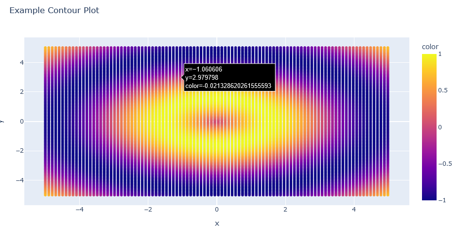
Explanation:
Importing Libraries:
import plotly.express as px: Importing Plotly Express for creating interactive visualizations.import numpy as np: Importing NumPy for generating sample data.Generating Sample Data for Contour Plot:
X, Y) of x and y values and generate corresponding z values (Z) to simulate a surface.Creating a Contour Plot:
px.contour(x=x, y=y, z=Z, title='Example Contour Plot'): Using Plotly Express, we create a Contour Plot with x and y as spatial coordinates and z as the data values. The title is set to ‘Example Contour Plot’.Displaying the Contour Plot:
contour_plot.show(): Displaying the Contour Plot.Contour Lines:
Color Mapping:
Density of Contour Lines:
Axis Representations:
Contours with Labels:
Contour Plots may include labels, displaying specific data values corresponding to each contour line. This provides precise information about the values represented.
Consider a Contour Plot depicting the elevation of a terrain. The contour lines represent lines of equal elevation, and the color scale illustrates the height variations. In this scenario:
Explore the power of Heatmaps in our Advanced Visualizations with Plotly, a dynamic visualization tool that provides a vivid representation of data intensity in a two-dimensional space. Heatmaps offer a visually intuitive way to discern patterns, trends, and variations within datasets. In this section, we’ll delve into the intricacies of Heatmaps, guide you through plotting them using Plotly Express, explore advanced customization options, and showcase insights into their practical applications. Additionally, we’ll unravel the art of interpreting Heatmaps, empowering you to extract meaningful information from these vibrant visualizations.
Let’s kickstart our exploration by mastering the art of plotting Heatmaps with Plotly Express. This versatile tool allows you to visualize data intensity using colors, providing an instant understanding of concentration and distribution. Here’s an illustrative example:

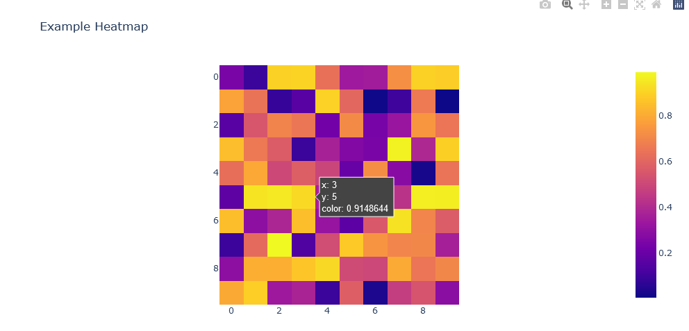
Importing Libraries:
import plotly.express as px: Importing Plotly Express for creating interactive visualizations.import numpy as np: Importing NumPy for generating sample data.Generating Sample Data for Heatmap:
Creating a Heatmap:
px.imshow(data, title='Example Heatmap'): Using Plotly Express, we create a Heatmap with the provided data matrix. The title is set to ‘Example Heatmap’.Displaying the Heatmap:
heatmap_plot.show(): Displaying the Heatmap.Understanding how to interpret Heatmaps is crucial for extracting valuable insights from your data. Here’s a guide on how to read Heatmaps effectively:
Color Intensity:
Color Scale Reference:
Axis Labels:
Patterns and Clusters:
Heatmaps find applications across various domains. Here are some scenarios:
Genomics and Biology: Visualize gene expression levels or DNA sequence alignments using Heatmaps.
Finance and Business: Analyze stock price movements, customer behaviors, or sales data with Heatmaps.
Climate Science: Represent temperature variations or climate patterns spatially using Heatmaps.
Healthcare: Visualize patient data, medical imaging, or disease spread within a region.
As you integrate Heatmaps into your data visualization toolkit, consider these techniques to unlock valuable insights and communicate complex patterns effectively.
Lets dive into the realm of Error Bars with our Advanced Visualizations with Plotly, a valuable component in data visualization that provides insights into the uncertainty and variability within datasets. Error Bars are graphical representations of the variability or uncertainty of data points in a graph. In this section, we will explore the significance of Error Bars, guide you through the implementation of Error Bars using Plotly Express, delve into advanced customization options, and shed light on their importance in data interpretation.
Let’s start our journey by understanding how to implement Error Bars using Plotly Express. Error Bars are commonly used to display the degree of uncertainty or variation around each data point. Here’s an example of implementing Error Bars in a bar chart:

Let’s start our journey by understanding how to implement Error Bars using Plotly Express. Error Bars are commonly used to display the degree of uncertainty or variation around each data point. Here’s an example of implementing Error Bars in a bar chart:
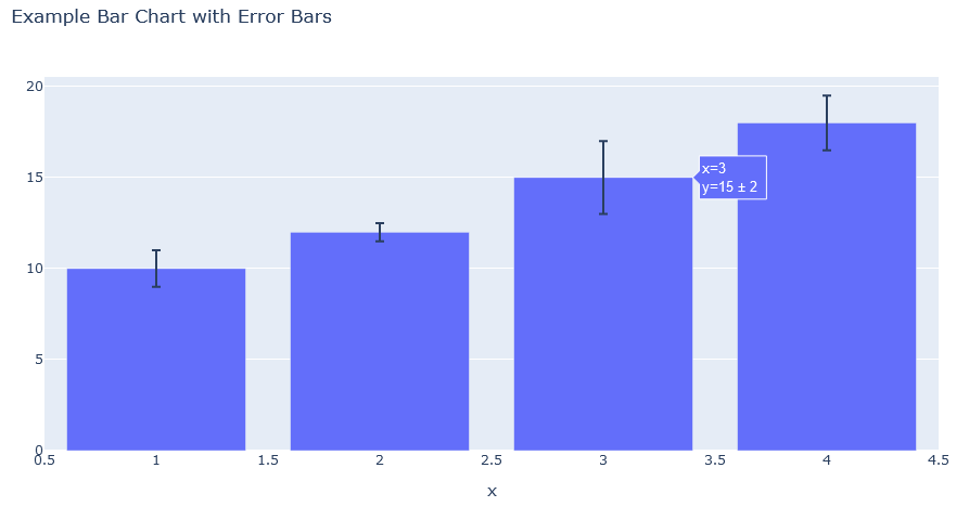
Explanation:
Importing Libraries:
import plotly.express as px: Importing Plotly Express for creating interactive visualizations.import numpy as np: Importing NumPy for generating sample data.Generating Sample Data for Error Bars:
x, y, error) where x represents the x-axis values, y represents the y-axis values, and error represents the error values for each data point.Creating a Bar Chart with Error Bars:
px.bar(x=x, y=y, error_y=error, title='Example Bar Chart with Error Bars'): Using Plotly Express, we create a Bar Chart with Error Bars. The error_y parameter is set to the array of error values.Displaying the Bar Chart with Error Bars:
error_bar_chart.show(): Displaying the Bar Chart with Error Bars.Enhance the visual representation and precision of your Error Bars through customization. Adjustments to error bar styles, colors, and widths can improve the clarity of uncertainty visualization. For instance:

Experiment with these options to tailor Error Bars to your data visualization needs.
Understanding the significance of Error Bars is crucial for accurate data interpretation. Error Bars provide valuable information about the variability and confidence in your data. Key points to consider:
Uncertainty Assessment:
Statistical Significance:
Precision in Measurements:
Comparative Analysis:
In this first half of our Advanced Visualizations with Plotly, we traversed the expansive landscape of data visualization. Beginning with the basics and installation intricacies, we swiftly moved into the realm of Plotly Express, crafting diverse plots with simplicity.
From Contour Plots providing spatial depth to exploring dynamic Dashboards with Dash, we’ve covered a spectrum of advanced topics. The stage is now set for deeper dives into 3D plots, map visualizations, and the dynamic storytelling potential of animated visualizations.
Part 2 awaits, promising further mastery in the art and science of advanced Plotly visualizations. Join us as we unlock more secrets, construct immersive dashboards, and explore best practices to elevate your data storytelling. The adventure continues, and the plot thickens.
If you enjoyed the blog follow 1stepGrow for more content like this.
We provide online certification in Data Science and AI, Digital Marketing, Data Analytics with a job guarantee program. For more information, contact us today!
Courses
1stepGrow
Terms
Anaconda | Jupyter Notebook | Git & GitHub (Version Control Systems) | Python Programming Language | R Programming Langauage | Linear Algebra & Statistics | ANOVA | Hypothesis Testing | Machine Learning | Data Cleaning | Data Wrangling | Feature Engineering | Exploratory Data Analytics (EDA) | ML Algorithms | Linear Regression | Logistic Regression | Decision Tree | Random Forest | Bagging & Boosting | PCA | SVM | Time Series Analysis | Natural Language Processing (NLP) | NLTK | Deep Learning | Neural Networks | Computer Vision | Reinforcement Learning | ANN | CNN | RNN | LSTM | Facebook Prophet | SQL | MongoDB | Advance Excel for Data Science | BI Tools | Tableau | Power BI | Big Data | Hadoop | Apache Spark | Azure Datalake | Cloud Deployment | AWS | GCP | AGILE & SCRUM | Data Science Capstone Projects | ML Capstone Projects | AI Capstone Projects | Domain Training | Business Analytics
WordPress | Elementor | On-Page SEO | Off-Page SEO | Technical SEO | Content SEO | SEM | PPC | Social Media Marketing | Email Marketing | Inbound Marketing | Web Analytics | Facebook Marketing | Mobile App Marketing | Content Marketing | YouTube Marketing | Google My Business (GMB) | CRM | Affiliate Marketing | Influencer Marketing | WordPress Website Development | AI in Digital Marketing | Portfolio Creation for Digital Marketing profile | Digital Marketing Capstone Projects
Jupyter Notebook | Git & GitHub | Python | Linear Algebra & Statistics | ANOVA | Hypothesis Testing | Machine Learning | Data Cleaning | Data Wrangling | Feature Engineering | Exploratory Data Analytics (EDA) | ML Algorithms | Linear Regression | Logistic Regression | Decision Tree | Random Forest | Bagging & Boosting | PCA | SVM | Time Series Analysis | Natural Language Processing (NLP) | NLTK | SQL | MongoDB | Advance Excel for Data Science | Alteryx | BI Tools | Tableau | Power BI | Big Data | Hadoop | Apache Spark | Azure Datalake | Cloud Deployment | AWS | GCP | AGILE & SCRUM | Data Analytics Capstone Projects
Bangalore:
Anjanapura | Arekere | Basavanagudi | Basaveshwara Nagar | Begur | Bellandur | Bommanahalli | Bommasandra | BTM Layout | CV Raman Nagar | Electronic City | Girinagar | Gottigere | Hebbal | Hoodi | HSR Layout | Hulimavu | Indira Nagar | Jalahalli | Jayanagar | J. P. Nagar | Kamakshipalya | Kalyan Nagar | Kammanahalli | Kengeri | Koramangala | Kothnur | Krishnarajapuram | Kumaraswamy Layout | Lingarajapuram | Mahadevapura | Mahalakshmi Layout | Malleshwaram | Marathahalli | Mathikere | Nagarbhavi | Nandini Layout | Nayandahalli | Padmanabhanagar | Peenya | Pete Area | Rajaji Nagar | Rajarajeshwari Nagar | Ramamurthy Nagar | R. T. Nagar | Sadashivanagar | Seshadripuram | Shivajinagar | Ulsoor | Uttarahalli | Varthur | Vasanth Nagar | Vidyaranyapura | Vijayanagar | White Field | Yelahanka | Yeshwanthpur
Other Top Cities:
Mumbai | Pune | Nagpur | Delhi | Gurugram | Chennai | Hyderabad | Coimbatore | Bhubaneswar | Kolkata | Indore | Jaipur and More