


Welcome to the fifth Part of our Matplotlib Python blog series “Advanced Plot Types in Matplotlib”, where we embark on a journey into the realm of advanced plot types. As we delve into the intricacies of histograms, box plots, heatmaps, and 3D plots in our “Advanced Plot Types in Matplotlib”, we open the door to a world of sophisticated visualization techniques. These advanced tools go beyond the basics, offering richer insights and enabling you to communicate complex information with precision and clarity. Join us as we unravel the power and versatility of these advanced plot types, equipping you with the skills to elevate your data visualization game to new heights.
Histograms stand as visual storytellers, unraveling the intricate tales hidden within datasets. In the realm of “Advanced Plot Types in Matplotlib”, histograms play a pivotal role in dissecting and understanding the distribution of data points. Let’s dive into the essence of histograms and unravel their significance in the analytical journey.
At its core, a histogram is a graphical representation that showcases the frequency or probability distribution of a set of continuous or discrete data. By organizing data into bins and representing the frequency of occurrences, histograms offer a dynamic snapshot of the data’s shape and spread.
Histograms serve as analytical magnifying glasses, allowing data analysts to discern patterns, trends, and central tendencies within a dataset. Whether exploring the spread of exam scores, the distribution of customer ages, or the frequency of website visits, histograms provide a visual roadmap for understanding the underlying story encoded in the numbers.
As we venture into the world of histograms in our “Advanced Plot Types in Matplotlib”, we’ll explore how these visualizations become windows into the soul of data. Discover how peaks and valleys in a histogram unveil modes and outliers, painting a vivid picture of the data’s narrative. Through this exploration, you’ll gain the tools to decode the subtle nuances and uncover the stories told by the distribution of data points.
Now that we comprehend the essence of histograms, let’s dive into the practical realm of creating these visual gems using Matplotlib. The journey begins with a step-by-step guide on transforming raw data into insightful histograms, followed by a showcase of customization options to add finesse to your visual narratives.
Creating histograms in Matplotlib is an art form that begins with importing the library and setting the stage for your visual masterpiece.
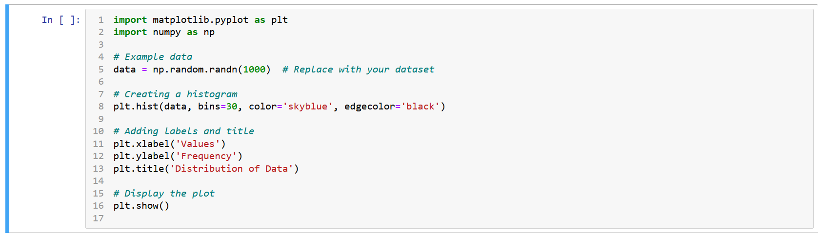
Output:
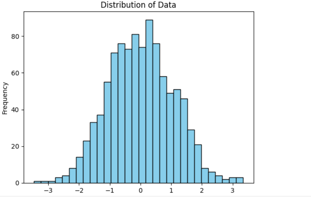
np.random.randn().plt.hist(), specifying the number of bins, color, and edgecolor.plt.xlabel(), plt.ylabel(), and plt.title().plt.show().Enhancing the visual impact of histograms involves customizing elements to align with your storytelling vision.
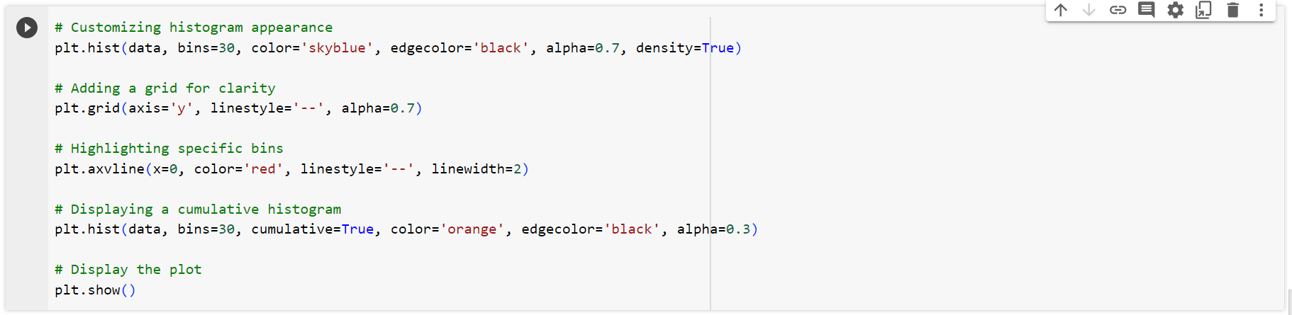
Output:
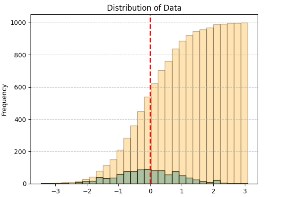
alpha to distinguish overlapping bars.plt.grid() for a clearer view.plt.axvline().cumulative=True.By following this guide and experimenting with customization options, you’ll transform your data into compelling histograms that not only convey information but also captivate your audience. Join us in mastering the art of histogram creation with Matplotlib!
Box plots, also known as box-and-whisker plots, emerge as powerful tools for summarizing and visualizing key statistics within a dataset. In this section in our “Advanced Plot Types in Matplotlib”, we embark on an exploration of box plots, defining their significance and unraveling the tales they tell about data distributions.
At its core, a box plot is a compact representation of the distribution of data, providing insights into central tendencies and variability. The plot consists of a rectangular “box” that spans the interquartile range (IQR) of the data, accompanied by whiskers that extend to the minimum and maximum values, encapsulating a wealth of statistical information.
Box plots serve as visual summaries, offering a snapshot of the data’s central tendencies, spread, and potential outliers. Whether exploring the distribution of exam scores or comparing the performance of different products, box plots distill complex statistical information into an accessible and informative format.
Understanding the components of a box plot is crucial for extracting meaningful insights:
Box (IQR): The box represents the interquartile range, indicating where the middle 50% of the data resides. The length of the box signifies the spread of this central portion.
Median (Q2): The line within the box represents the median, showcasing the midpoint of the dataset.
Whiskers: Whiskers extend from the box to the minimum and maximum values within a specified range. They provide a visual gauge of data variability.
Outliers: Individual data points beyond the whiskers are considered outliers, potentially indicating unique or unexpected observations.
Join us on this journey of statistical exploration as we delve deeper into box plots, unraveling their components and deciphering the rich narratives they convey about data distributions.
Now that we comprehend the essence of box plots, let’s embark on a hands-on tutorial to transform raw data into insightful box plots using the powerful Matplotlib library. This section serves as your guide, providing step-by-step instructions and unveiling customization options to tailor your box plots to the nuances of your datasets.
Tutorial on Creating Box Plots:
Creating box plots with Matplotlib involves a series of intuitive steps, transforming your dataset into a visual narrative. Let’s walk through the process:
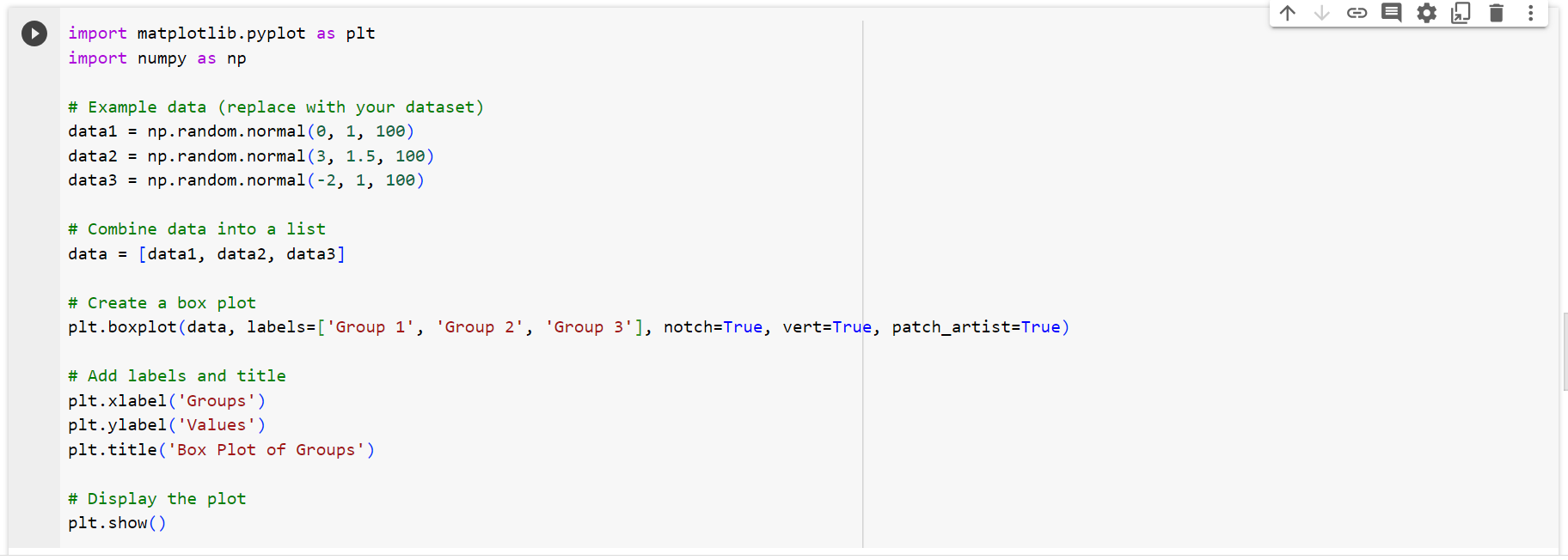
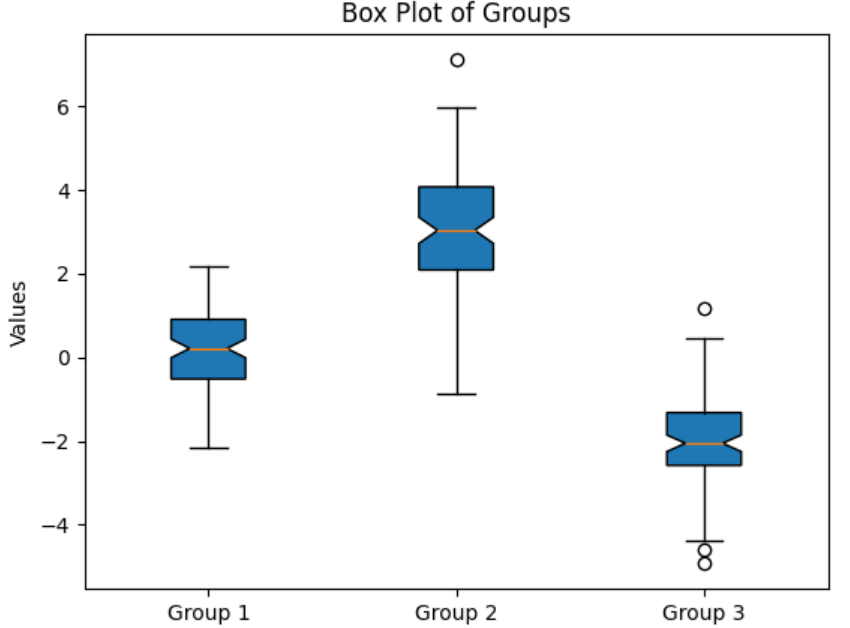
Explanation:
plt.boxplot(), specifying labels, notch, orientation, and patch_artist for customization.plt.xlabel(), plt.ylabel(), and plt.title().plt.show().Tailor your box plots to suit the needs of your data:

Output:
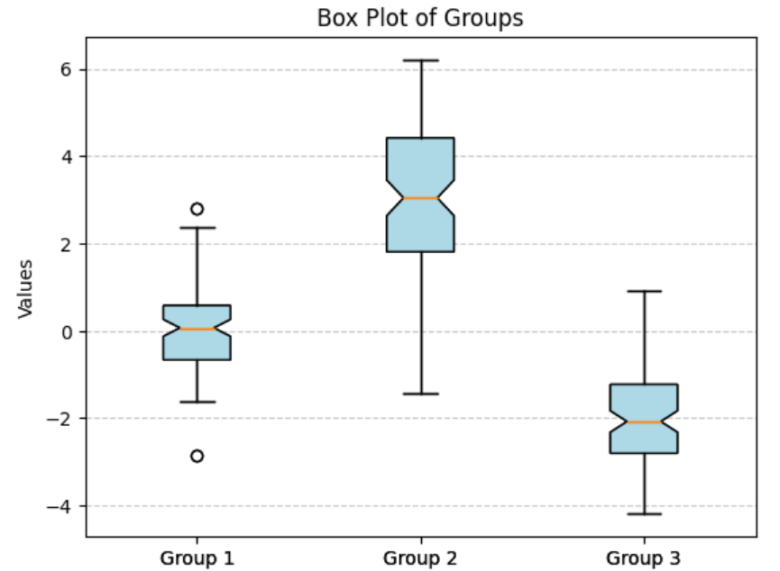
patch_artist and boxprops.plt.grid() for enhanced clarity.Box plots shine in scenarios where you seek to compare the distribution of multiple groups or understand the spread and central tendencies of a single dataset. Whether in statistical analysis, medical research, or business analytics, box plots offer a concise visualization of complex statistical information.
By mastering the construction of box plots in Matplotlib and understanding the art of customization, you equip yourself with a powerful tool for unraveling the stories hidden within your data. Join us in this journey of statistical exploration, where every box plot becomes a canvas for understanding and interpreting your datasets.
Let’s dive into practical application scenarios where box plots shine as indispensable tools for visualizing summary statistics and conveying insights across diverse fields. We’ll use a custom dataset to illustrate the power of box plots in action.
In the realm of education, understanding student performance is crucial. A box plot of exam scores across multiple classes can reveal not only the median and spread of scores but also highlight potential outliers, aiding educators in identifying classes that may need additional support.
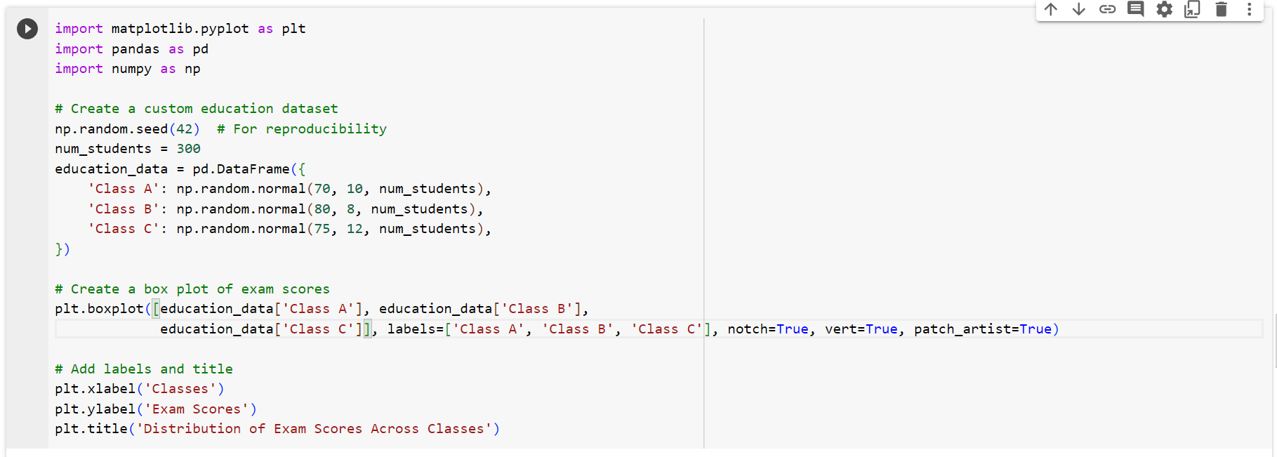
In this example, we generate a custom education dataset with exam scores for three classes. The resulting box plot provides a clear comparison of the central tendencies and spreads of scores, enabling educators to identify areas of strength and potential improvement.
Box plots find practical applications in business settings, particularly in HR and performance evaluations. By visualizing metrics such as monthly sales performance across different sales teams, organizations can quickly identify high-performing teams, benchmark performance, and guide resource allocation.
Example Code:
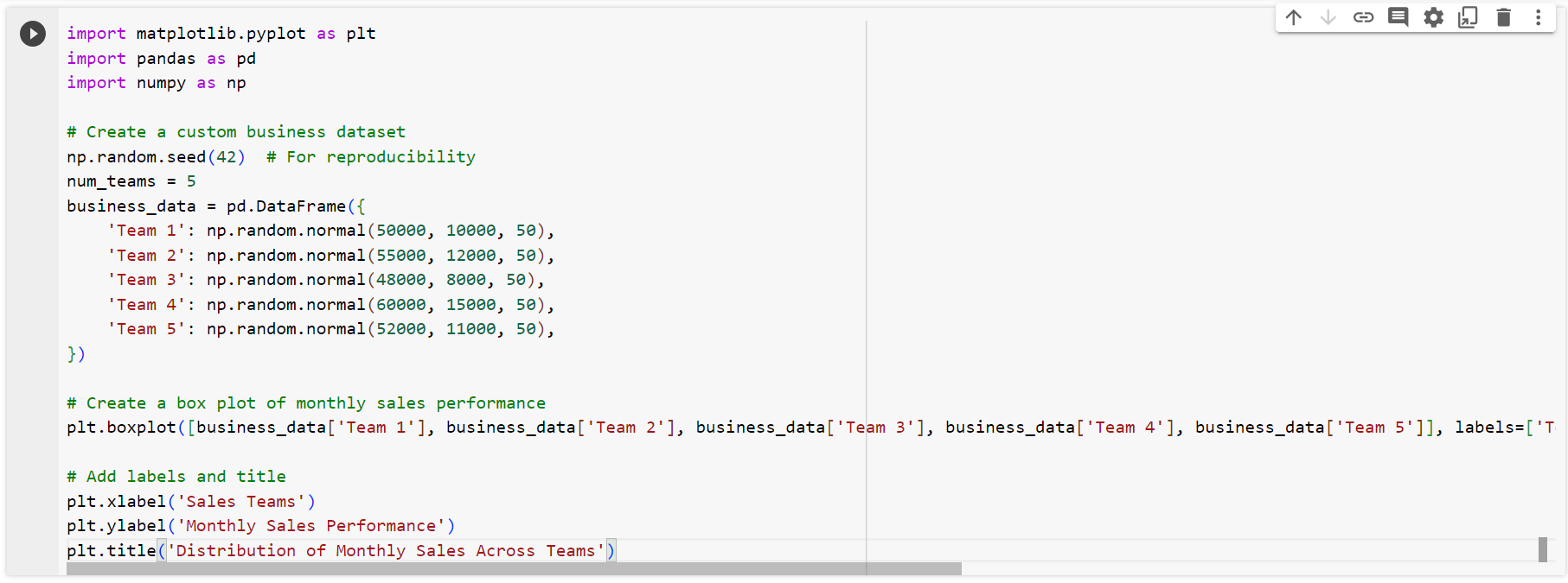
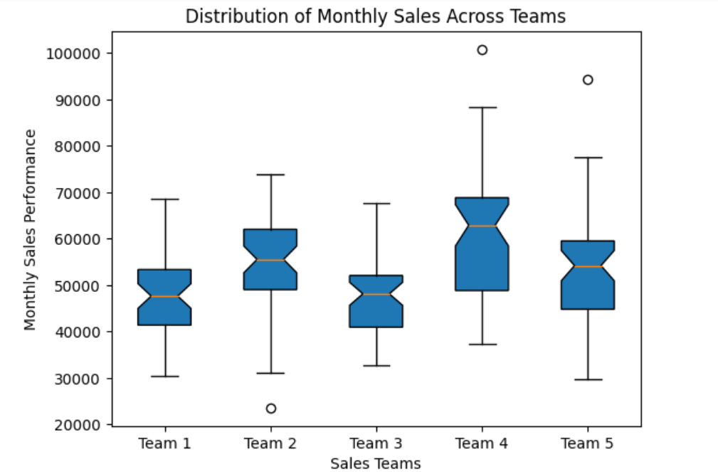
In this business-oriented example, the box plot allows for a quick comparison of monthly sales performance across different teams, aiding management decisions and fostering healthy competition.
These application scenarios demonstrate the versatility of box plots in translating summary statistics into visually interpretable insights, making them valuable assets in decision-making processes across diverse fields.
As we delve into the realm of data visualization in our “Advanced Plot Types in Matplotlib”, heatmaps emerge as powerful and visually captivating tools, particularly when illuminating the intricate relationships within correlation matrices. In this section, we embark on a journey to explore the prowess of heatmaps, understanding their significance in unraveling patterns and connections concealed within complex datasets.
A heatmap is more than a vibrant display of colors; it is a dynamic canvas that transforms numerical relationships into an accessible visual language. Specifically designed for correlation matrices, heatmaps provide an intuitive representation where each cell’s color intensity reflects the strength and direction of the correlation between variables. This visual simplicity belies the depth of insight they offer, making them indispensable in the arsenal of data analysts and scientists.
The beauty of heatmaps lies in their ability to highlight patterns that might otherwise remain obscured in rows and columns of numerical values. By assigning colors to correlation coefficients, heatmaps enable swift identification of positive, negative, or neutral associations. Whether deciphering the relationships between financial indicators, biological variables, or customer behaviors, heatmaps provide a visual compass, guiding analysts toward areas of interest and potential exploration.
In this exploration of heatmaps, we will not only unravel the mechanics of their creation but also appreciate how these visualizations become powerful allies in the quest to decipher complex correlations. Join us in this journey as we illuminate correlation matrices, turning them into vibrant landscapes of insight with the magic of heatmaps.
Now that we understand the essence of heatmaps, let’s embark on a practical journey to generate these captivating visualizations using the versatile Matplotlib library. In this section, we provide you with step-by-step instructions, empowering you to transform raw data into vibrant heatmaps that reveal the intricate relationships within correlation matrices.
Creating a heatmap with Matplotlib involves a harmonious interplay of code elements. Follow these steps to embark on your visual exploration:
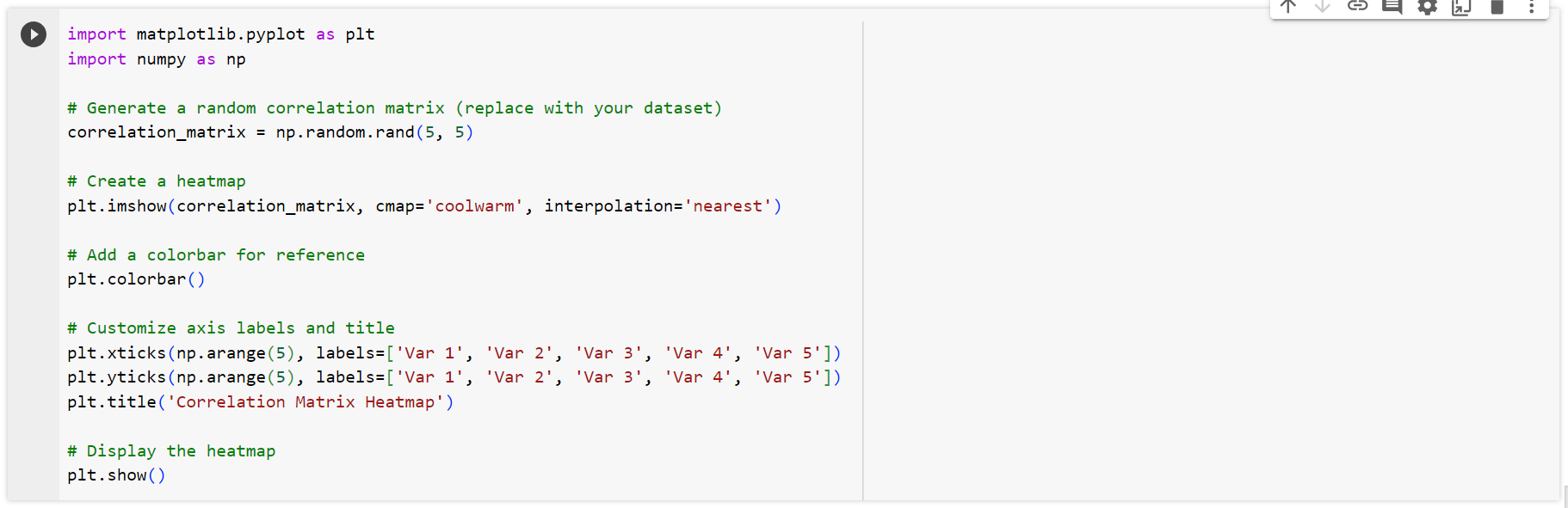
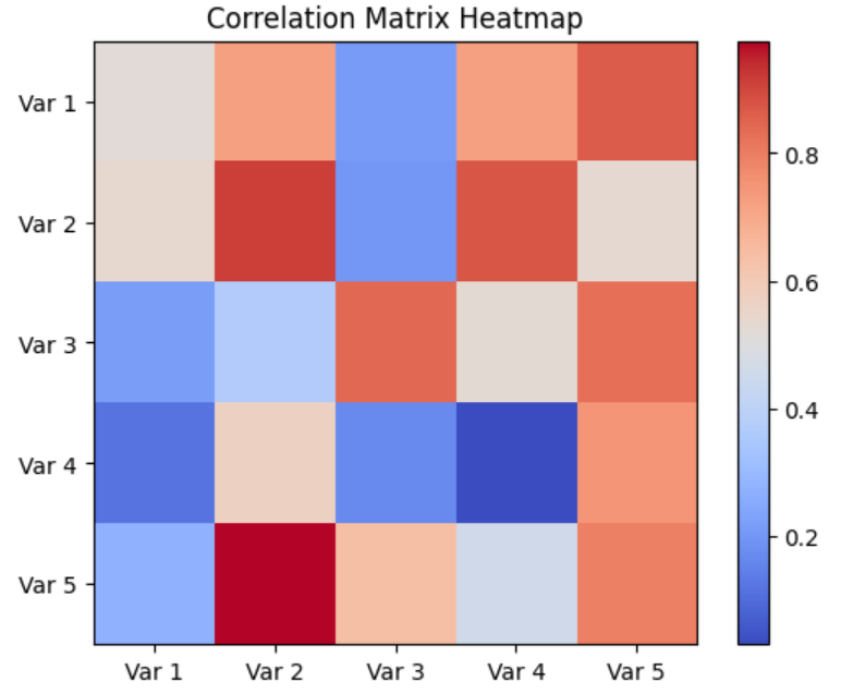
plt.imshow(), specifying the colormap and interpolation method for visual clarity.plt.colorbar() for reference.plt.xticks(), plt.yticks(), and plt.title().plt.show().Tailor your heatmap to convey information with precision and clarity:

Output:
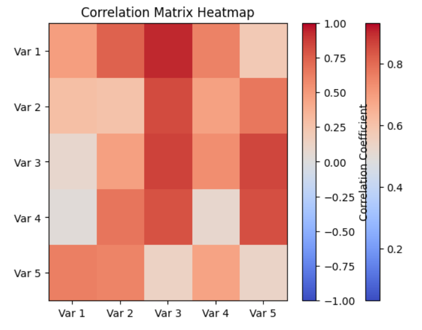
aspect='auto'.vmin and vmax for a meaningful color scale.By following these steps and experimenting with customization features, you’ll master the art of generating insightful heatmaps in Matplotlib. Join us as we transform data into a visual symphony, revealing the hidden patterns within correlation matrices.
Embarking on a deeper exploration, we unravel the practical utility of heatmaps across diverse fields—finance, biology, and social sciences. These real-world use cases showcase how heatmaps transcend the realm of theory, becoming indispensable instruments for insightful data analysis and decision-making.
In finance, where numbers hold the pulse of markets, heatmaps become financial cartographers. Visualizing correlations among stocks, market indices, or economic indicators empowers analysts to swiftly identify trends, detect anomalies, and make informed investment decisions. Whether unraveling the interplay of currency pairs or assessing the impact of economic events, heatmaps offer a visual compass in the dynamic landscape of finance.
Example Code:
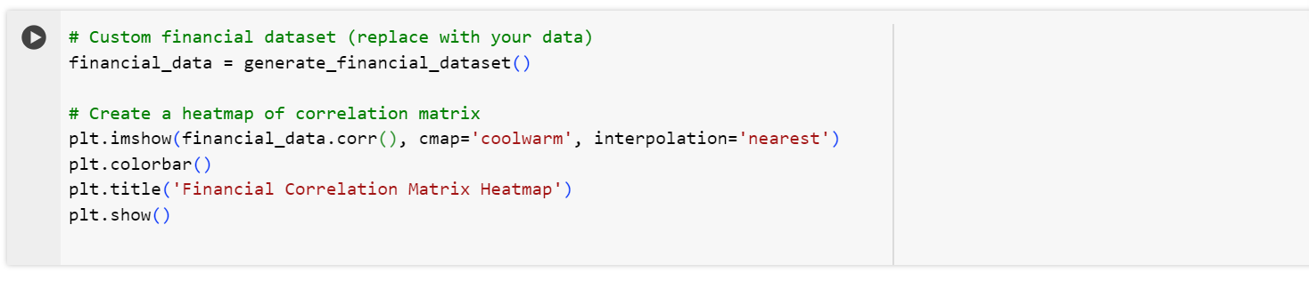
In biology, the intricate dance of molecular relationships comes to life through heatmaps. Analyzing gene expression patterns or understanding the interactions within biological systems becomes more accessible. Heatmaps empower researchers to pinpoint genetic correlations, explore pathways, and gain insights into the complex machinery of life.
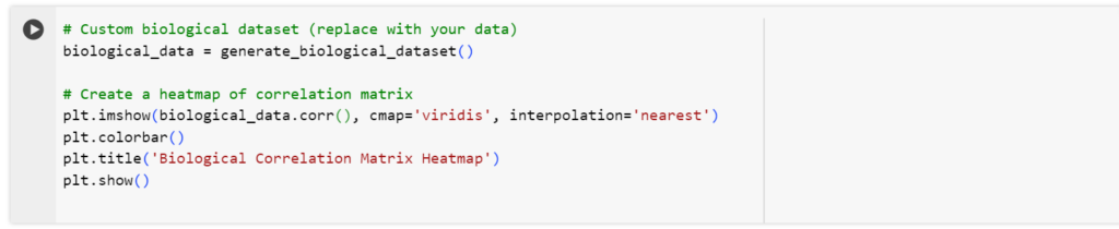
In these practical use cases, heatmaps transcend the abstract, offering a visual language that resonates across industries. Join us as we navigate through the concrete applications of heatmaps, revealing their transformative role in decoding complexities and extracting actionable insights from real-world datasets.
As we continue our exploration of “Advanced Plot Types in Matplotlib”,, we step into the captivating world of 3D plots—a realm where data transcends the confines of traditional 2D representations. In this section, we introduce you to the concept of 3D plots, unraveling their significance in visualizing data in three dimensions and illuminating scenarios where these plots offer unique insights.
Imagine a canvas that extends not only in width and height but also in depth—a spatial playground where data points exist in a multidimensional dance. 3D plots provide precisely this immersive experience, allowing us to visualize relationships and patterns that might remain hidden in two-dimensional renderings. From geological terrains to molecular structures, 3D plots become powerful lenses, offering a richer perspective on complex datasets.
The human experience is inherently three-dimensional, and our understanding of the world is enriched when data is presented in a spatial context. Whether exploring volumetric data, depicting the evolution of variables over time, or dissecting intricate geometries, 3D plots transcend flatland, providing a holistic view that resonates with the way we perceive and interpret the physical world.
In the upcoming segments of this section, we will guide you through the mechanics of creating compelling 3D plots using Matplotlib. Join us in this journey as we unveil the third dimension, transforming your data into multidimensional stories that captivate and inform.
Now, let’s delve into the practical realm of generating 3D plots using Matplotlib. This tutorial not only equips you with the syntax and customization techniques but also provides essential guidelines on when and how to wield 3D plots effectively.
Creating a 3D plot involves orchestrating elements in the spatial canvas. Here’s a step-by-step guide to sculpting dimensions with code:
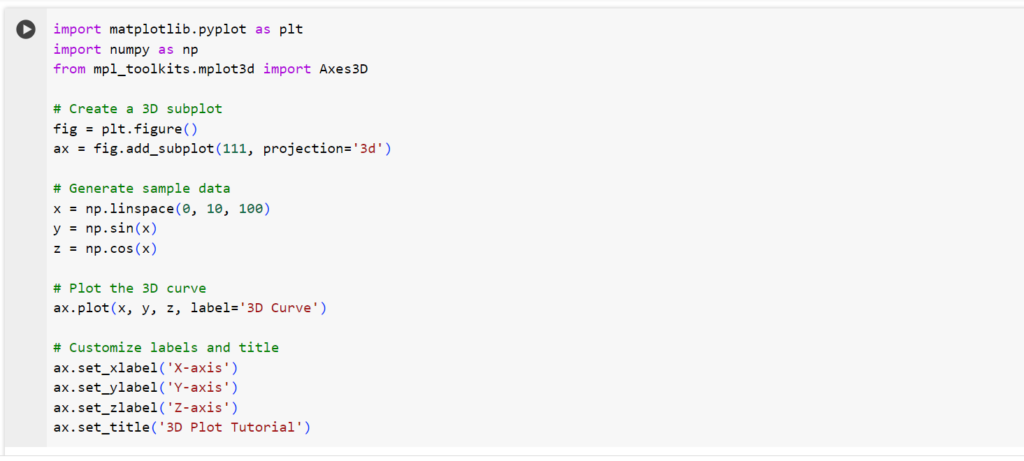
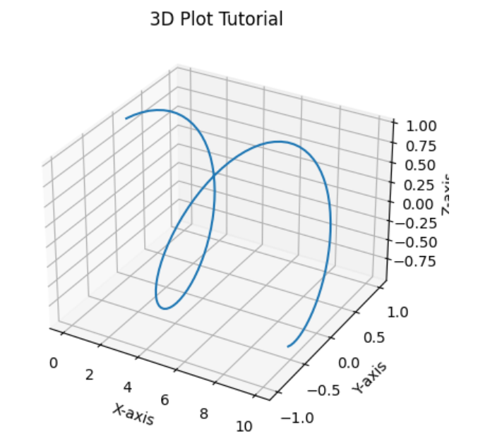
plt.figure() and add_subplot().ax.plot() with specified labels.ax.set_xlabel(), ax.set_ylabel(), ax.set_zlabel(), and ax.set_title().plt.show().Understanding when and how to use 3D plots enhances their communicative power:
By following this tutorial and adhering to effective guidelines, you’ll unlock the potential of 3D plots to convey intricate stories hidden within your data. Join us as we sculpt dimensions with code, breathing life into multidimensional narratives.
As we draw the curtain on our exploration of “Advanced Plot Types in Matplotlib”, it’s time to distill the essence of our journey into key takeaways. In this concluding segment, we recap the insights gained, illuminate the expanded possibilities for conveying complex information, and extend an invitation for readers to integrate these advanced techniques into their data visualization repertoire.
Visual Symphony Unleashed: Advanced plot types serve as the conductor’s baton, transforming raw data into a visual symphony. From 3D plots sculpting dimensions to heatmaps illuminating correlations, each technique adds a layer of richness to our storytelling canvas.
Beyond Two Dimensions: We’ve transcended the flatland of traditional plots, venturing into multidimensional landscapes. Line plots, scatter plots, histograms—these are not just tools; they are brushes, sculpting narratives in the spatial and temporal dimensions.
Real-world Applications: Beyond the theoretical realm, we’ve showcased the real-world applications of these advanced techniques. Whether deciphering financial trends, unraveling biological relationships, or mapping social dynamics, the impact of these plots reverberates across diverse fields.
Our exploration has opened doors to a world of possibilities in data visualization. The third dimension is no longer a mere concept; it’s a tangible asset. Heatmaps reveal intricate relationships, box plots distill summary statistics, and 3D plots unfold spatial narratives—each offering a unique lens to extract insights from complex datasets.
Now equipped with these advanced techniques from our “Advanced Plot Types in Matplotlib”, we encourage you to seamlessly integrate them into your data visualization repertoire. Let your plots tell stories that resonate with depth and clarity. Experiment with customization, explore applications in your domain, and unlock the potential of Matplotlib as your creative canvas.
In mastering advanced plot types, you’ve not only added tools to your kit but elevated your ability to communicate complex information visually. As you venture into the realm of multidimensional storytelling, remember that each plot is a brushstroke, contributing to the masterpiece of data visualization. Happy plotting. If you enjoyed then follow 1stepgrow.


We provide online certification in Data Science and AI, Digital Marketing, Data Analytics with a job guarantee program. For more information, contact us today!
Courses
1stepGrow
Anaconda | Jupyter Notebook | Git & GitHub (Version Control Systems) | Python Programming Language | R Programming Langauage | Linear Algebra & Statistics | ANOVA | Hypothesis Testing | Machine Learning | Data Cleaning | Data Wrangling | Feature Engineering | Exploratory Data Analytics (EDA) | ML Algorithms | Linear Regression | Logistic Regression | Decision Tree | Random Forest | Bagging & Boosting | PCA | SVM | Time Series Analysis | Natural Language Processing (NLP) | NLTK | Deep Learning | Neural Networks | Computer Vision | Reinforcement Learning | ANN | CNN | RNN | LSTM | Facebook Prophet | SQL | MongoDB | Advance Excel for Data Science | BI Tools | Tableau | Power BI | Big Data | Hadoop | Apache Spark | Azure Datalake | Cloud Deployment | AWS | GCP | AGILE & SCRUM | Data Science Capstone Projects | ML Capstone Projects | AI Capstone Projects | Domain Training | Business Analytics
WordPress | Elementor | On-Page SEO | Off-Page SEO | Technical SEO | Content SEO | SEM | PPC | Social Media Marketing | Email Marketing | Inbound Marketing | Web Analytics | Facebook Marketing | Mobile App Marketing | Content Marketing | YouTube Marketing | Google My Business (GMB) | CRM | Affiliate Marketing | Influencer Marketing | WordPress Website Development | AI in Digital Marketing | Portfolio Creation for Digital Marketing profile | Digital Marketing Capstone Projects
Jupyter Notebook | Git & GitHub | Python | Linear Algebra & Statistics | ANOVA | Hypothesis Testing | Machine Learning | Data Cleaning | Data Wrangling | Feature Engineering | Exploratory Data Analytics (EDA) | ML Algorithms | Linear Regression | Logistic Regression | Decision Tree | Random Forest | Bagging & Boosting | PCA | SVM | Time Series Analysis | Natural Language Processing (NLP) | NLTK | SQL | MongoDB | Advance Excel for Data Science | Alteryx | BI Tools | Tableau | Power BI | Big Data | Hadoop | Apache Spark | Azure Datalake | Cloud Deployment | AWS | GCP | AGILE & SCRUM | Data Analytics Capstone Projects
Anjanapura | Arekere | Basavanagudi | Basaveshwara Nagar | Begur | Bellandur | Bommanahalli | Bommasandra | BTM Layout | CV Raman Nagar | Electronic City | Girinagar | Gottigere | Hebbal | Hoodi | HSR Layout | Hulimavu | Indira Nagar | Jalahalli | Jayanagar | J. P. Nagar | Kamakshipalya | Kalyan Nagar | Kammanahalli | Kengeri | Koramangala | Kothnur | Krishnarajapuram | Kumaraswamy Layout | Lingarajapuram | Mahadevapura | Mahalakshmi Layout | Malleshwaram | Marathahalli | Mathikere | Nagarbhavi | Nandini Layout | Nayandahalli | Padmanabhanagar | Peenya | Pete Area | Rajaji Nagar | Rajarajeshwari Nagar | Ramamurthy Nagar | R. T. Nagar | Sadashivanagar | Seshadripuram | Shivajinagar | Ulsoor | Uttarahalli | Varthur | Vasanth Nagar | Vidyaranyapura | Vijayanagar | White Field | Yelahanka | Yeshwanthpur
Mumbai | Pune | Nagpur | Delhi | Gurugram | Chennai | Hyderabad | Coimbatore | Bhubaneswar | Kolkata | Indore | Jaipur and More