


Welcome to the “Getting Started with ggplot2” blog series – your gateway to mastering the art of data visualization! In this dynamic series, we’ll delve into the depths of ggplot2, a powerful Python package, to unlock the secrets of creating impactful and visually stunning plots.
Embark on this journey with us as we guide you through the fundamental concepts and practical applications of ggplot2. This series is crafted for both beginners seeking a solid foundation and seasoned data enthusiasts aiming to refine their skills.
Get ready to embrace active learning and hands-on exploration, as each part of this series builds upon the last to elevate your understanding of ggplot2.
Let’s dive into the world of data visualization, where insights come to life. Welcome to Part 1 of the “Getting Started with ggplot2” series – a venture into the heart of compelling data storytelling.
Let’s chat about why visualizing data is like the superhero of the data world and how ggplot2 is our trusty sidekick making it all happen. You see, when it comes to dealing with numbers and stats, turning them into cool visuals is what helps us understand the story they’re telling.
So, what’s ggplot2? Well, it’s like this magical tool in Python, created by a cool person named Hadley Wickham. What makes it stand out is its way of turning complicated data into awesome graphics. It follows this idea called the ‘grammar of graphics,’ which basically means it has a straightforward and clear way of making cool visualizations.
Advantages of using ggplot2:
Challenges? Yeah, a Bit:
So, get ready to join us on this chill journey into ggplot2. We’ll be unwrapping all its cool features, one visual at a time. No fancy talk, just plain ol’ understanding of how to make your data speak volumes with ggplot2!
Now that we’re all set to embark on our journey into the enchanting realm of ggplot2, the first pitstop is learning how to install and load this magical package. Think of it as acquiring your superhero suit before venturing into the superhero world. Let’s roll up our sleeves and dive into the nitty-gritty of this process.
Before we can unleash the power of ggplot2, we need to make sure it’s installed on our Python playground. Fortunately, this process is a piece of cake. Open up your Python environment – be it Jupyter Notebook, Colab, or any other – and fire up a new code cell.
!pip install ggplot
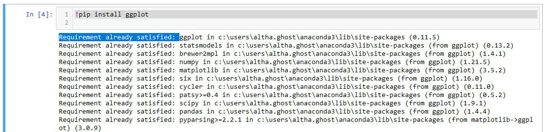
That’s it! With a swift command, you’ve summoned ggplot2 into your toolkit. Imagine it as sending out a call to your trusty sidekick who’s now ready to assist you in turning boring data into captivating visuals.
Now that ggplot2 is in your arsenal, it’s time to bring it to life. Loading a package in Python is like unlocking a treasure chest full of tools – each waiting for your command. In the same code cell, type:
from ggplot import *
There you go! You’ve officially opened the door to the magical world of ggplot2. Now, every function and feature it offers is at your disposal. It’s akin to your superhero suit being fully equipped with all the gadgets you need.
The ‘from’ Statement: By using ‘from ggplot import ‘, you’re essentially telling Python to import everything (the ‘‘) from the ggplot package. This means you get access to all the functions and features without having to call them separately.
Why Load ggplot2? Loading ggplot2 is like opening a toolbox. It gives you access to a range of functions that simplify the process of creating various plots. Without loading, ggplot2 would be dormant, and we wouldn’t be able to tap into its visual prowess.
Now, armed with the knowledge of installing and loading ggplot2, you’re all set to unleash the magic in the subsequent chapters. So, let’s flex those coding muscles and bring your data to life with ggplot2’s captivating visuals!
Congratulations on successfully installing ggplot2! Now, let’s embark on an insightful exploration of the basic structure that underpins every ggplot2 plot. This journey involves unraveling the intricacies of essential components, revealing how they seamlessly converge to craft a compelling visual representation of your data.
At the heart of ggplot2 plotting lies the ggplot() function – the orchestrator of your visual symphony. It’s the command that kickstarts the entire process, providing a canvas upon which your data story unfolds. Consider it the director saying, “Lights, camera, action!”

Here, we’re telling ggplot2 to use the data from “my_data” and map “my_variable” to the x-axis and “another_variable” to the y-axis.
Enter the geoms – the visual building blocks that bring your data to life on the plot. Geoms are like actors in a play, taking on roles such as points, lines, or bars. They define how your data is portrayed visually, turning abstract numbers into tangible representations.

In this snippet, we’re using geom_point() to incorporate data points onto the plot.
Aesthetic mapping is where the magic unfolds. It’s the wizardry that connects variables in your dataset to specific visual elements in your plot. This is the language you use to convey to ggplot2 which aspects of your data should be represented by which parts of your plot.

Here, we’re using aesthetic mapping to indicate that the color of the points represents the “category_variable,” and the size is determined by the “value_variable.”
Just as a painter selects a palette, you can customize the look and feel of your ggplot2 plot. Themes control the overall aesthetics, while color scales dictate the color palette used in your visualization.

This snippet showcases the use of themes and color scales to give your plot a minimalistic appearance with a gradient color scheme.
To ensure your visual narrative is crystal clear, annotations and labels play a pivotal role. These elements add context, guiding your audience to interpret the story your data is telling.

In this example, labs() is used to label the x and y axes and provide a title to the plot.
We’ll walk through a step-by-step demonstration, illustrating how each element harmonizes to create a compelling ggplot2 plot. This practical walkthrough will empower you to wield ggplot2 effectively.
As with any journey, there may be challenges. We’ll explore common pitfalls and provide strategies to troubleshoot issues, ensuring a smooth and rewarding plotting experience.
By comprehending the basic structure of a ggplot2 plot, you’re not just creating visuals; you’re crafting a visual narrative where each element contributes to the story. Armed with this knowledge, let’s dive into the world of ggplot2 and transform your data into captivating visualizations. Happy plotting!
As we navigate the expansive realm of ggplot2, one concept takes center stage – Aesthetic Mapping, often referred to as aes. This fundamental building block is the secret sauce that transforms your raw data into a rich visual narrative. In this exploration, we’ll unravel the intricacies of aes, understanding how it serves as the bridge between your data and the visual elements that bring it to life on your plot.
Imagine aes as the enchanting process that imbues your plot with life and meaning. Aesthetic mapping is the language through which you communicate to ggplot2 how variables in your dataset should manifest visually. It’s the artistic connection between the abstract world of data and the tangible elements on your plot.

In this snippet, aes is used to convey that the x-axis corresponds to “variable_x,” the y-axis to “variable_y,” the color of the points represents “category_variable,” and the size of the points is determined by “value_variable.”
Variables: These are the attributes from your dataset that you want to represent visually. It could be numerical values, categories, or any other relevant data.
Visual Elements: Aesthetic mapping links variables to specific visual elements on your plot. For instance, you can map a variable to the x-axis, y-axis, color, size, shape, and more.
Understanding how to map variables to visual elements is pivotal. It’s like instructing ggplot2 on which aspects of your data should be translated into specific aspects of your plot. This connection adds depth and nuance to your visualization.
Continuous Variables: When mapping continuous variables (like age or temperature), you might use them for x and y coordinates or size.
Categorical Variables: For categorical variables (like colors or shapes representing different groups), aesthetic mapping ensures each category is visually distinct.
Let’s delve into a practical example to showcase the power of aesthetic mapping. Consider a scenario where you have a dataset with information about cities, their populations, and their GDPs. Aesthetic mapping can transform this data into a visually compelling story.

Here, we’re using aes to link Population to the x-axis, GDP to the y-axis, Continent to color, and Happiness_Index to the size of points. The resulting plot provides a nuanced representation of city data.
As you become proficient in aesthetic mapping, you can explore advanced techniques, such as mapping multiple variables to different aesthetics, using transformations, and integrating statistical functions into the mapping process.

In this example, we’ve added a logarithmic transformation to the size variable, showcasing the versatility of aesthetic mapping.
Consistency is Key: Maintain consistency in your mapping across geoms to ensure a coherent visual language.
Understanding Scale: Be aware of how your variables are scaled, especially when mapping continuous variables.
Clarity in Communication: Aesthetic mapping should enhance clarity, not create confusion. Ensure your audience can interpret the visual elements accurately.
Let’s apply our understanding of aesthetic mapping to a real-world scenario. Imagine you have data on monthly sales for different products. Aesthetic mapping can transform this data into an insightful sales trend visualization
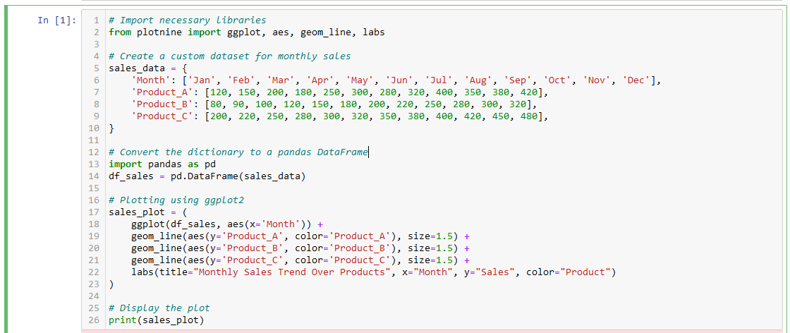
In this case, aesthetic mapping communicates that the x-axis represents months, the y-axis represents sales, and different product categories are distinguished by color.
ggplot, aes, geom_line, and labs from the plotnine library.Create a Custom Dataset: We create a custom dataset (sales_data) containing months and sales data for three hypothetical products (Product_A, Product_B, and Product_C).
Convert to DataFrame: We convert the dictionary to a pandas DataFrame (df_sales) for easy handling.
Plotting with ggplot2: Using the ggplot2 syntax, we create a line plot for each product, specifying the x-axis as ‘Month’ and the y-axis as the respective product’s sales. We differentiate each product by assigning a unique color.
Additional Details: We add a title, x-axis label, y-axis label, and a legend to enhance the interpretability of the plot.
Display the Plot: Finally, we print the plot, and you can use this code snippet in your blog to demonstrate how aesthetic mapping can be applied to visualize real-world data scenarios.
As you delve into aesthetic mapping, be mindful of potential pitfalls. Common challenges include misinterpretation of scales, misalignment of data types, or overlooking the appropriateness of the chosen visual elements.
Scale Mismatch: Ensure that variables mapped to the same aesthetic have compatible scales. For instance, mapping a continuous variable to both size and color might lead to misinterpretation if the scales differ significantly.
Data Type Considerations: Understand the nature of your variables. Mapping a categorical variable to a continuous scale, or vice versa, might result in unintended visual outcomes.
Now equipped with a comprehensive understanding of aesthetic mapping, you’re poised to elevate your ggplot2 prowess. The ability to effectively convey data stories through visual elements is a powerful skill, and aesthetic mapping is your key to unlocking this potential.
As you experiment with your datasets, remember that aesthetic mapping is an art form within the ggplot2 universe. It’s not just about creating plots; it’s about crafting a visual language that resonates with your audience, transforming data into insights, and ultimately, telling a compelling story. So, harness the magic of aesthetic mapping, and let your data speak through the vibrant canvas of ggplot2.
Now that we’ve laid the foundation with aesthetic mapping, let’s roll up our sleeves and dive into the practical realm of creating scatter plots and line charts using ggplot2. These versatile plot types are invaluable tools for representing relationships between variables with clarity and precision. In this hands-on guide, we’ll explore the step-by-step process of crafting visually compelling scatter plots and line charts.
Scatter plots are ideal for visualizing the relationship between two continuous variables. They allow us to observe patterns, trends, and potential correlations within the data.

In this example, replace ‘Variable1’ and ‘Variable2’ with the actual variable names from your dataset. The geom_point() function adds points to represent each data point on the plot.
Explanation:
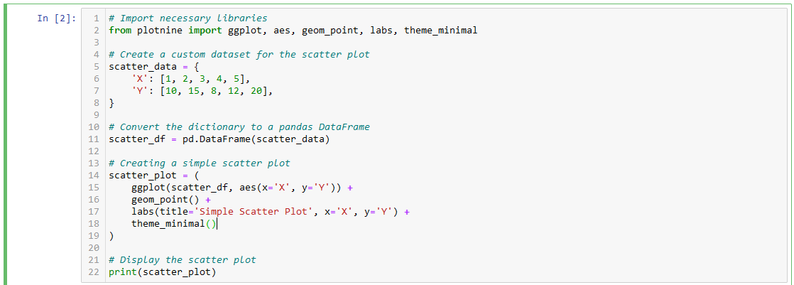
Example:
Output:
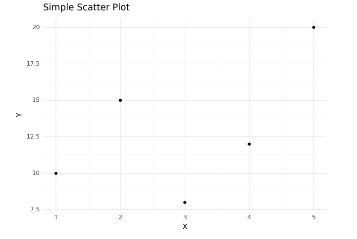
ggplot(scatter_df, aes(x='X', y='Y')): Initiates the scatter plot and specifies the x and y variables.geom_point(): Adds points to represent each data point on the plot.labs(title='Simple Scatter Plot', x='X', y='Y'): Sets the title and axis labels.theme_minimal(): Applies a minimalistic theme to the plot.Run this code, and it should display a simple scatter plot with the specified title, axis labels, and a minimal theme.
For revealing trends and patterns over a continuous variable, line charts are indispensable. They are particularly useful when showcasing changes in data over time.

Replace ‘Time’ and ‘Variable3’ with your specific time-related variable and the variable you want to track.
Explanation:
Lets now look at a practical example:
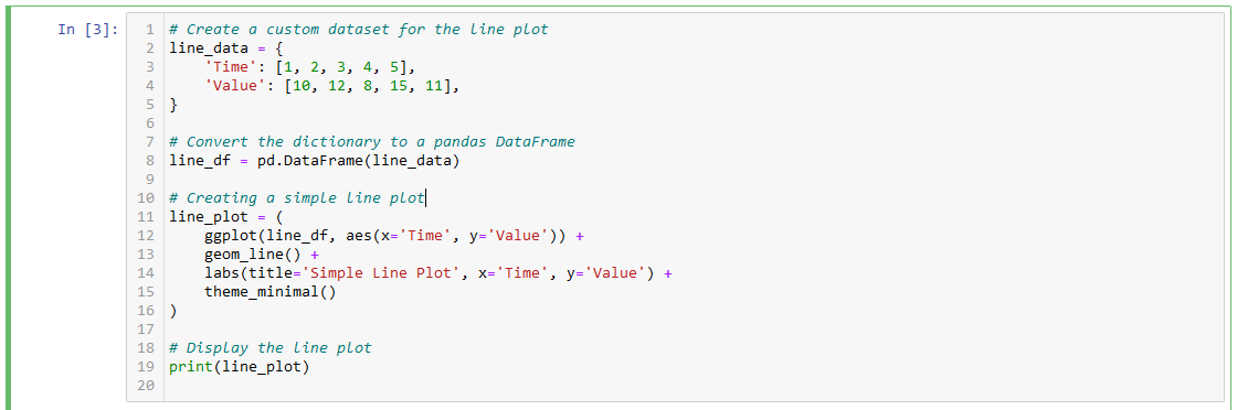
Output:
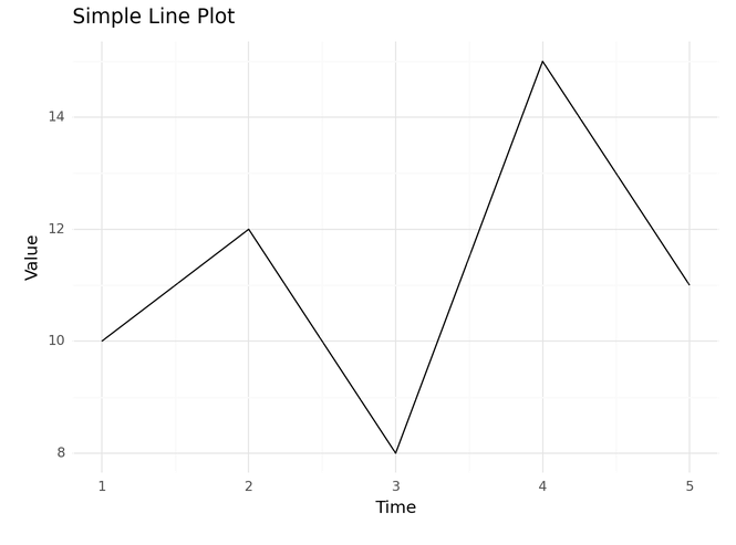
Explanation – Line Plot Example:
ggplot(line_df, aes(x='Time', y='Value')): Initiates the line plot and specifies the x and y variables.geom_line(): Connects data points with lines to visualize trends over time.labs(title='Simple Line Plot', x='Time', y='Value'): Sets the title and axis labels.theme_minimal(): Applies a minimalistic theme to the plot.With these tools and insights, you’re ready to wield ggplot2 for creating impactful scatter plots and line charts. Remember, the key lies not only in crafting visually appealing plots but also in effectively communicating the story your data tells.
As you embark on your journey with ggplot2, the ability to customize colors and themes becomes paramount. Your visualizations are not just data representations; they are a canvas for your narrative. In this section, we’ll delve into the art of personalization, exploring how to infuse your plots with a touch of your style.
Colors evoke emotions and emphasize patterns. In ggplot2, you can customize the colors of your plots to create visually stunning representations. Let’s consider a scatter plot with a categorical variable, and we want each category to have a distinct color.

scale_color_manual(values=['#FF5733', '#33FF57', '#5733FF']): Manually sets the colors for each category.Themes unify your plots, providing a consistent and polished look. The choice of a theme can enhance readability and overall aesthetics. Let’s explore applying a theme to a line chart.

Explanation:
theme_minimal(): Applies the minimalistic theme to the entire plot.The ggplot2 library offers a variety of themes to suit different preferences. Let’s explore the ‘dark_background’ theme for a bar plot.

Explanation:
theme_dark(): Applies the ‘dark_background’ theme for a visually striking effect.Customizing axes and labels adds clarity to your plots. Let’s adjust the x-axis labels for a horizontal box plot.

theme(axis_text_x=element_text(angle=45, hjust=1)): Rotates x-axis labels for improved readability.For a truly personalized touch, create a custom color palette that aligns with your brand or storytelling. This can be applied to various plots, such as a line chart.

scale_color_manual(values=custom_palette): Applies your custom color palette to the plot.By mastering the art of customization in ggplot2, you elevate your visualizations from informative to captivating. Experiment with colors, themes, and styles to find the perfect balance that resonates with your audience. Happy customizing!
Let’s create a comprehensive code snippet that incorporates various customizing options, including color customization, theme application, axis and label adjustments, and the use of a custom color palette. We’ll use a hypothetical dataset to showcase these customizations in a line chart.
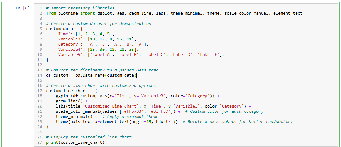
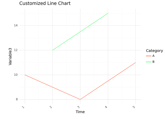
scale_color_manual(values=['#FF5733', '#33FF57']): Manually sets the colors for each category in the line chart.theme_minimal(): Applies a minimalistic theme to the entire plot.theme(axis_text_x=element_text(angle=45, hjust=1)): Rotates x-axis labels for improved readability.Feel free to run this code to see the customized line chart with the specified colors, theme, and axis label adjustments. You can adapt and extend these customizations based on your preferences and the specific requirements of your data visualization.
In this journey through ggplot2, we traversed from foundational concepts to hands-on crafting. Starting with understanding data visualization’s importance and ggplot2’s role, we delved into practicalities like installation and basic plotting structures. From creating scatter plots to customizing colors and themes, we explored the art of storytelling through data. As we conclude this leg, you’ve acquired the tools for visually compelling narratives. Stay tuned for the advanced chapters, where ggplot2’s prowess will be unleashed further. If you enjoyed the blog follow 1stepgrow Happy plotting!


We provide online certification in Data Science and AI, Digital Marketing, Data Analytics with a job guarantee program. For more information, contact us today!
Courses
1stepGrow
Anaconda | Jupyter Notebook | Git & GitHub (Version Control Systems) | Python Programming Language | R Programming Langauage | Linear Algebra & Statistics | ANOVA | Hypothesis Testing | Machine Learning | Data Cleaning | Data Wrangling | Feature Engineering | Exploratory Data Analytics (EDA) | ML Algorithms | Linear Regression | Logistic Regression | Decision Tree | Random Forest | Bagging & Boosting | PCA | SVM | Time Series Analysis | Natural Language Processing (NLP) | NLTK | Deep Learning | Neural Networks | Computer Vision | Reinforcement Learning | ANN | CNN | RNN | LSTM | Facebook Prophet | SQL | MongoDB | Advance Excel for Data Science | BI Tools | Tableau | Power BI | Big Data | Hadoop | Apache Spark | Azure Datalake | Cloud Deployment | AWS | GCP | AGILE & SCRUM | Data Science Capstone Projects | ML Capstone Projects | AI Capstone Projects | Domain Training | Business Analytics
WordPress | Elementor | On-Page SEO | Off-Page SEO | Technical SEO | Content SEO | SEM | PPC | Social Media Marketing | Email Marketing | Inbound Marketing | Web Analytics | Facebook Marketing | Mobile App Marketing | Content Marketing | YouTube Marketing | Google My Business (GMB) | CRM | Affiliate Marketing | Influencer Marketing | WordPress Website Development | AI in Digital Marketing | Portfolio Creation for Digital Marketing profile | Digital Marketing Capstone Projects
Jupyter Notebook | Git & GitHub | Python | Linear Algebra & Statistics | ANOVA | Hypothesis Testing | Machine Learning | Data Cleaning | Data Wrangling | Feature Engineering | Exploratory Data Analytics (EDA) | ML Algorithms | Linear Regression | Logistic Regression | Decision Tree | Random Forest | Bagging & Boosting | PCA | SVM | Time Series Analysis | Natural Language Processing (NLP) | NLTK | SQL | MongoDB | Advance Excel for Data Science | Alteryx | BI Tools | Tableau | Power BI | Big Data | Hadoop | Apache Spark | Azure Datalake | Cloud Deployment | AWS | GCP | AGILE & SCRUM | Data Analytics Capstone Projects
Anjanapura | Arekere | Basavanagudi | Basaveshwara Nagar | Begur | Bellandur | Bommanahalli | Bommasandra | BTM Layout | CV Raman Nagar | Electronic City | Girinagar | Gottigere | Hebbal | Hoodi | HSR Layout | Hulimavu | Indira Nagar | Jalahalli | Jayanagar | J. P. Nagar | Kamakshipalya | Kalyan Nagar | Kammanahalli | Kengeri | Koramangala | Kothnur | Krishnarajapuram | Kumaraswamy Layout | Lingarajapuram | Mahadevapura | Mahalakshmi Layout | Malleshwaram | Marathahalli | Mathikere | Nagarbhavi | Nandini Layout | Nayandahalli | Padmanabhanagar | Peenya | Pete Area | Rajaji Nagar | Rajarajeshwari Nagar | Ramamurthy Nagar | R. T. Nagar | Sadashivanagar | Seshadripuram | Shivajinagar | Ulsoor | Uttarahalli | Varthur | Vasanth Nagar | Vidyaranyapura | Vijayanagar | White Field | Yelahanka | Yeshwanthpur
Mumbai | Pune | Nagpur | Delhi | Gurugram | Chennai | Hyderabad | Coimbatore | Bhubaneswar | Kolkata | Indore | Jaipur and More