


Embark on a visual odyssey with our second installment, ‘Unveiling Data Patterns: Exploring Relationships with ggplot2.’ As we delve deeper into the capabilities of ggplot2, this blog promises to unravel the intricate relationships within your data. Building on the fundamentals covered in our first blog, we’ll navigate through the creation of bar plots, histograms, and box plots, bringing clarity to both categorical and continuous datasets. The exploration doesn’t stop there – we’ll elevate your visualizations with trendlines, regression models, and the art of faceting for insightful subplots. Fine-tune your annotations and labels for precision, ensuring your audience interprets your data narratives seamlessly. Join us on this journey of discovery as we empower you to decipher the hidden patterns and relationships concealed within your datasets. Let’s dive in and bring your data stories to life with ggplot2!
In this section, we’ll delve into the powerful visualization tools of bar plots and histograms, essential for unraveling insights from both categorical and continuous data.
Bar plots are a fundamental visualization tool for exploring the distribution of categorical variables. They provide a visual representation of the frequency or count of each category, making it easy to identify patterns and trends within the data.
Let’s assume we have a dataset called categorical_data with a column named category representing different categories. Here’s how you can create a basic bar plot using ggplot2 in Python:
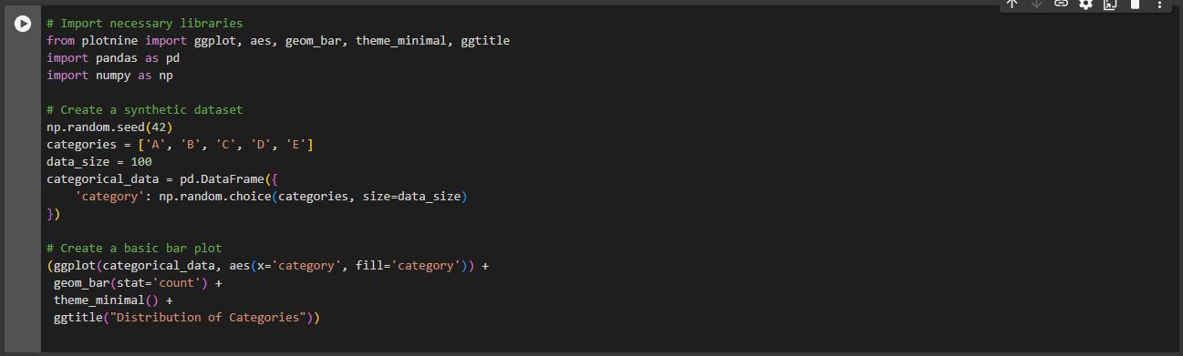
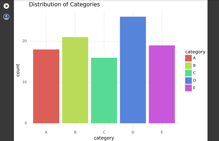
ggplot: Initiates the ggplot2 plot.gg.aes(x='category', fill='category'): Defines aesthetics for the plot, specifying the x-axis and fill color based on the ‘category’ column.gg.geom_bar(stat='count'): Adds the bar geometry to the plot, using the ‘count’ statistic to determine the height of each bar.gg.theme_minimal(): Applies a minimal theme for better visual clarity.gg.ggtitle("Distribution of Categories"): Adds a title to the plot.Bar plots are particularly useful when dealing with categorical data, helping you quickly grasp the distribution and relative frequencies of different categories within your dataset. As we explore more visualization techniques, bar plots lay the foundation for understanding the characteristics of your data.
Histograms are powerful tools for visualizing the distribution of numerical variables, providing insights into the underlying patterns and characteristics of the data.
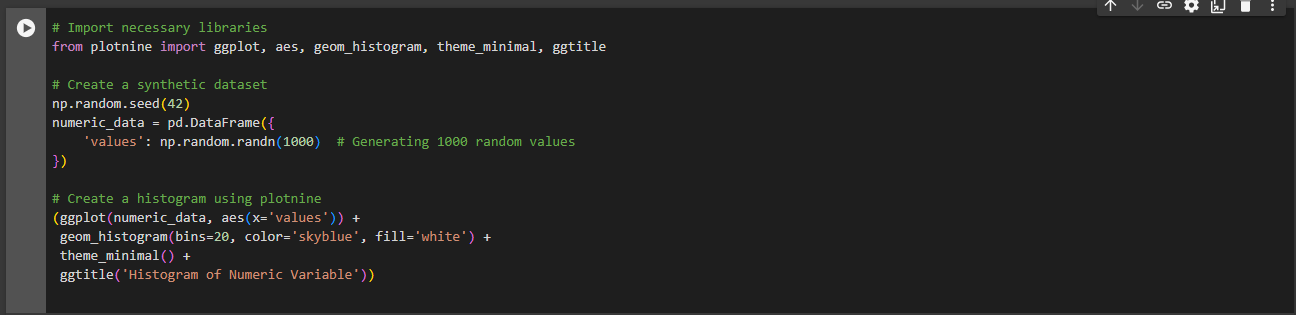
Assuming we have a dataset named numeric_data with a column called values representing a numeric variable. Here’s how you can create a histogram using plotnine:
Output:
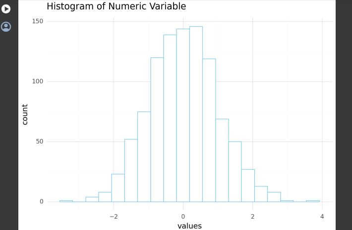
ggplot function to initialize the plot.aes(x='values') defines the aesthetic mapping, specifying the x-axis as the ‘values’ column.geom_histogram() adds the histogram layer to the plot. The bins parameter determines the number of bins (intervals) in the histogram.theme_minimal() applies a minimal theme for better visual clarity.ggtitle('Histogram of Numeric Variable') sets the title of the histogram.Shape of the Distribution: The shape of the histogram provides insights into the distribution of the numeric variable, resembling the ggplot2 syntax.
Central Tendency: The central tendency of the data can be identified by looking at the center of the distribution.
Spread of Data: The spread or dispersion of the data is reflected in the width of the histogram.
Outliers: Outliers, if present, can be visually identified as data points that fall far from the main concentration of values.
Histograms, created using the ggplot2 syntax in Python with plotnine, are valuable for exploring the characteristics of numerical data and gaining insights into its distribution.
Box plots are powerful tools for understanding the distribution of numerical data, providing a visual summary of key statistics and helping identify outliers.
Let’s use a dataset named numeric_data with a column named values representing a numeric variable. Here’s how you can create a box plot using plotnine:
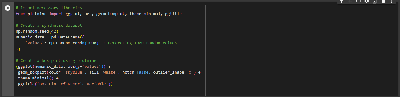
Output:
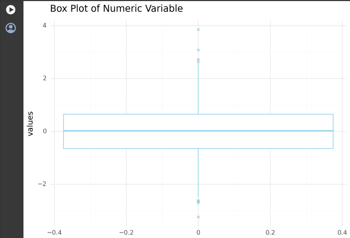
Output:
ggplot function to initialize the plot.aes(y='values') defines the aesthetic mapping, specifying the y-axis as the ‘values’ column.geom_boxplot() adds the box plot layer to the plot. Parameters like color, fill, notch, and outlier_shape customize the appearance of the box plot.theme_minimal() applies a minimal theme for better visual clarity.ggtitle('Box Plot of Numeric Variable') sets the title of the box plot.Box and Whiskers: The box in the plot represents the interquartile range (IQR), while the whiskers extend to the minimum and maximum values within a certain range.
Outliers: Individual data points beyond the whiskers are considered outliers and are displayed as individual points.
Notch: The notch in the box plot provides a rough guide to the significance of the difference between the medians of two groups. If the notches of two box plots do not overlap, it suggests a significant difference in medians.
Box plots offer a concise summary of the distribution of numerical data, making it easy to identify central tendencies, spread, and potential outliers.
Enhance your visualizations by incorporating trendlines and regression models, providing deeper insights into the relationships between variables.
Let’s consider a dataset named scatter_data with two numerical variables, variable1 and variable2. Here’s how you can create a scatter plot with a trendline using plotnine:
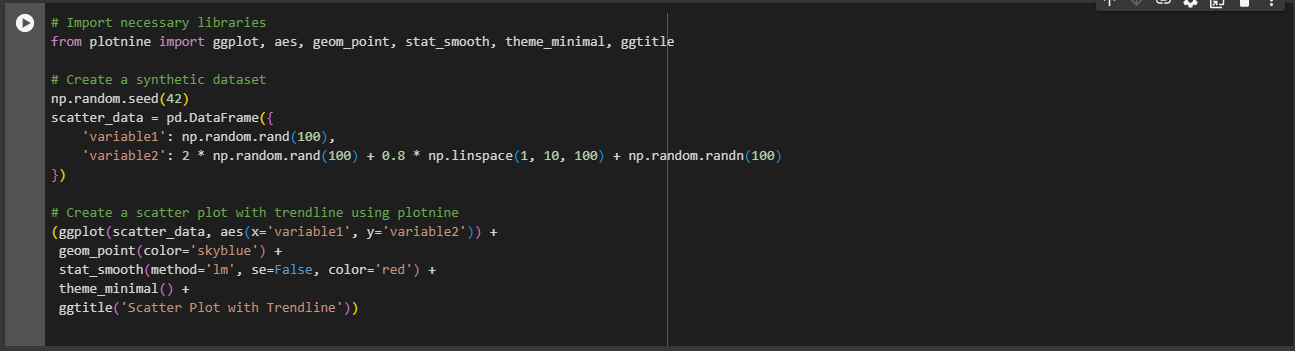
Output:
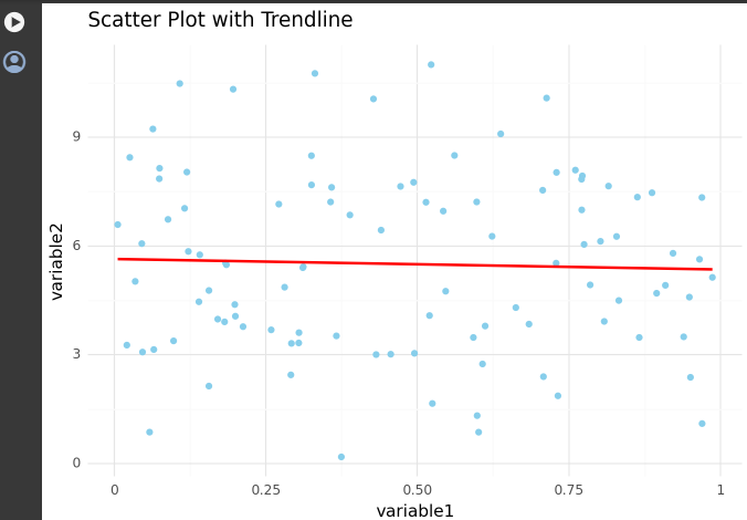
ggplot function to initialize the plot.aes(x='variable1', y='variable2') defines the aesthetic mapping, specifying the x-axis as ‘variable1’ and y-axis as ‘variable2’.geom_point(color='skyblue') adds the scatter plot layer to the plot with blue points.stat_smooth(method='lm', se=False, color='red') adds a linear regression trendline (method='lm') without confidence intervals (se=False) in red color.theme_minimal() applies a minimal theme for better visual clarity.ggtitle('Scatter Plot with Trendline') sets the title of the scatter plot.Trendline: The trendline represents the best-fit linear regression model for the given data points.
Slope: The slope of the trendline indicates the strength and direction of the relationship between the variables.
Intercept: The intercept represents the expected value of the dependent variable when the independent variable is zero.
R-squared: The R-squared value quantifies the proportion of the variance in the dependent variable explained by the independent variable(s).
By incorporating trendlines and regression models, you can visually assess the relationship between variables and gain insights into the underlying patterns in your data. This is particularly useful for identifying trends and making predictions based on observed patterns
Enhance your data visualizations by creating multiple subplots based on a categorical variable, a technique known as faceting. Faceting provides a clear and organized way to explore relationships within different categories.
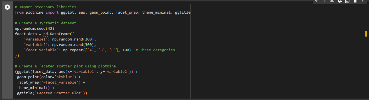
Assume we have a dataset named facet_data with numerical variables variable1 and variable2, as well as a categorical variable facet_variable. Here’s how you can create a faceted scatter plot using plotnine:
Output:
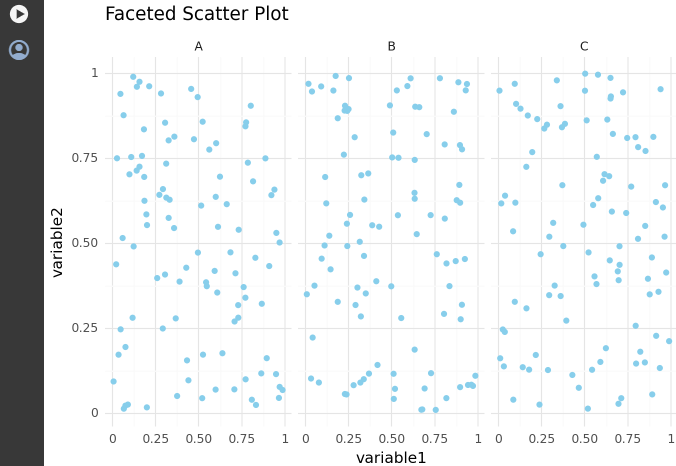
ggplot function to initialize the plot.aes(x='variable1', y='variable2') defines the aesthetic mapping, specifying the x-axis as ‘variable1’ and y-axis as ‘variable2’.geom_point(color='skyblue') adds the scatter plot layer to the plot with blue points.facet_wrap('~facet_variable') creates subplots based on the levels of the categorical variable ‘facet_variable’.theme_minimal() applies a minimal theme for better visual clarity.ggtitle('Faceted Scatter Plot') sets the title of the faceted scatter plot.Comparison Across Categories: Faceting allows for a direct comparison of the distribution or relationship within different categories.
Improved Readability: Instead of displaying all data in a single plot, faceting organizes information into smaller, digestible subplots, enhancing readability.
Efficient Exploration: Faceted plots are particularly useful when exploring interactions between variables, providing a comprehensive view of relationships.
Insights into Variability: Faceting helps in understanding how the relationship or distribution varies across different levels of a categorical variable.
By employing faceting in your visualizations, you can efficiently explore and communicate insights within and across different categories, providing a more nuanced understanding of your data.
Elevate the communicative power of your visualizations by incorporating annotations and labels. This technique allows you to highlight specific points or patterns, adding valuable context to your plots.
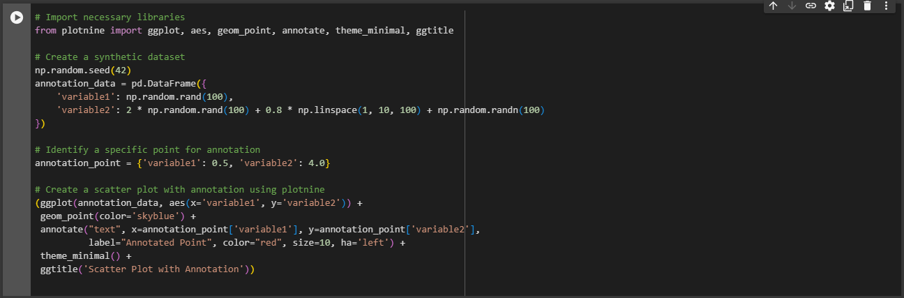
Let’s use a dataset named annotation_data with numerical variables variable1 and variable2. Here’s how you can create a scatter plot with annotations using plotnine:
Output:
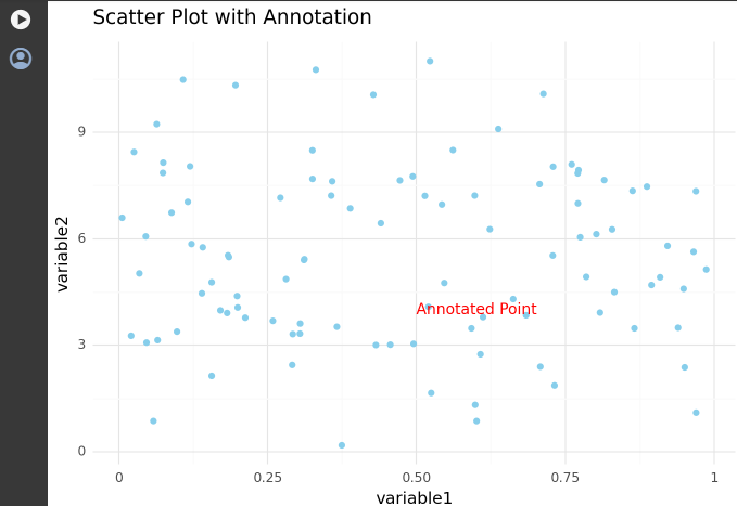
ggplot function to initialize the plot.aes(x='variable1', y='variable2') defines the aesthetic mapping.geom_point(color='skyblue') adds the scatter plot layer to the plot.annotate("text", x=..., y=..., label=..., color=..., size=..., ha=...) adds a text annotation at a specific point on the plot.theme_minimal() applies a minimal theme for better visual clarity.ggtitle('Scatter Plot with Annotation') sets the title of the scatter plot.Highlighting Key Findings: Annotations can draw attention to specific data points or trends that are crucial for interpretation.
Adding Context to Outliers: Annotations provide an opportunity to explain or highlight outliers, offering context to the viewer.
Emphasizing Events or Changes: Annotations are useful for marking significant events or changes in the data, aiding in storytelling.
Enhancing Readability: Annotations can be employed to label axes, add units, or clarify information, improving the overall readability of the plot.
By judiciously incorporating annotations and labels, you can enrich your visualizations and ensure that viewers easily grasp the key insights and nuances within the data.
Improve the clarity and readability of your visualizations by customizing labels. Thoughtful label customization ensures that viewers can easily interpret and understand the information presented in your plots.
Assume we have a dataset named custom_label_data with numerical variables variable1 and variable2. Here’s how you can create a scatter plot with customized labels using plotnine:
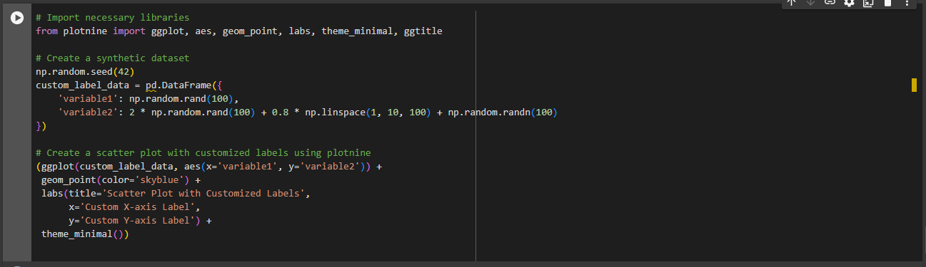
Output:
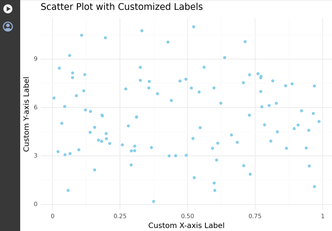
ggplot function to initialize the plot.aes(x='variable1', y='variable2') defines the aesthetic mapping.geom_point(color='skyblue') adds the scatter plot layer to the plot.labs(title=..., x=..., y=...) customizes the plot labels, including the title, x-axis label, and y-axis label.theme_minimal() applies a minimal theme for better visual clarity.Enhanced Interpretation: Clear and concise labels contribute to the viewer’s ability to interpret the plot accurately.
Contextual Information: Custom labels provide additional context, guiding the audience in understanding the variables represented in the plot.
Improved Communication: Well-crafted labels are fundamental to effective communication, helping convey the intended message of the visualization.
Reduced Ambiguity: Clear labels reduce ambiguity and potential misinterpretations, ensuring that the audience extracts the intended insights.
Customizing labels is a critical aspect of data visualization, directly impacting how well your audience can engage with and comprehend the information presented. By investing time in thoughtful label customization, you enhance the overall effectiveness of your visualizations.
In this blog journey, we harnessed the capabilities of ggplot2 in Python to craft compelling data visualizations. We covered bar plots, histograms, box plots, and explored advanced techniques like adding trendlines, faceting for subplots, and fine-tuning with annotations and customized labels.
Our exploration revealed that ggplot2 is not just a plotting library; it’s a storytelling tool. By mastering its syntax, we transformed data into expressive narratives. Whether highlighting outliers, exploring categorical nuances, or adding trendlines for deeper insights, ggplot2 offered a dynamic canvas for data exploration.
As you venture forth, armed with the versatility of ggplot2, remember: your data has a story to tell, and ggplot2 provides the means to tell it effectively. If you enjoyed the blog follow 1stepgrow, Happy plotting!
Embark on a visual odyssey with our second installment, ‘Unveiling Data Patterns: Exploring Relationships with ggplot2.’ As we delve deeper into the capabilities of ggplot2, this blog promises to unravel the intricate relationships within your data. Building on the fundamentals covered in our first blog, we’ll navigate through the creation of bar plots, histograms, and box plots, bringing clarity to both categorical and continuous datasets. The exploration doesn’t stop there – we’ll elevate your visualizations with trendlines, regression models, and the art of faceting for insightful subplots. Fine-tune your annotations and labels for precision, ensuring your audience interprets your data narratives seamlessly. Join us on this journey of discovery as we empower you to decipher the hidden patterns and relationships concealed within your datasets. Let’s dive in and bring your data stories to life with ggplot2!
In this section, we’ll delve into the powerful visualization tools of bar plots and histograms, essential for unraveling insights from both categorical and continuous data.
Bar plots are a fundamental visualization tool for exploring the distribution of categorical variables. They provide a visual representation of the frequency or count of each category, making it easy to identify patterns and trends within the data.
Let’s assume we have a dataset called categorical_data with a column named category representing different categories. Here’s how you can create a basic bar plot using ggplot2 in Python:
ggplot: Initiates the ggplot2 plot.gg.aes(x='category', fill='category'): Defines aesthetics for the plot, specifying the x-axis and fill color based on the ‘category’ column.gg.geom_bar(stat='count'): Adds the bar geometry to the plot, using the ‘count’ statistic to determine the height of each bar.gg.theme_minimal(): Applies a minimal theme for better visual clarity.gg.ggtitle("Distribution of Categories"): Adds a title to the plot.Bar plots are particularly useful when dealing with categorical data, helping you quickly grasp the distribution and relative frequencies of different categories within your dataset. As we explore more visualization techniques, bar plots lay the foundation for understanding the characteristics of your data.
Histograms are powerful tools for visualizing the distribution of numerical variables, providing insights into the underlying patterns and characteristics of the data.
Assuming we have a dataset named numeric_data with a column called values representing a numeric variable. Here’s how you can create a histogram using plotnine:
Output:
ggplot function to initialize the plot.aes(x='values') defines the aesthetic mapping, specifying the x-axis as the ‘values’ column.geom_histogram() adds the histogram layer to the plot. The bins parameter determines the number of bins (intervals) in the histogram.theme_minimal() applies a minimal theme for better visual clarity.ggtitle('Histogram of Numeric Variable') sets the title of the histogram.Shape of the Distribution: The shape of the histogram provides insights into the distribution of the numeric variable, resembling the ggplot2 syntax.
Central Tendency: The central tendency of the data can be identified by looking at the center of the distribution.
Spread of Data: The spread or dispersion of the data is reflected in the width of the histogram.
Outliers: Outliers, if present, can be visually identified as data points that fall far from the main concentration of values.
Histograms, created using the ggplot2 syntax in Python with plotnine, are valuable for exploring the characteristics of numerical data and gaining insights into its distribution.
Box plots are powerful tools for understanding the distribution of numerical data, providing a visual summary of key statistics and helping identify outliers.
Let’s use a dataset named numeric_data with a column named values representing a numeric variable. Here’s how you can create a box plot using plotnine:
Output:
Output:
ggplot function to initialize the plot.aes(y='values') defines the aesthetic mapping, specifying the y-axis as the ‘values’ column.geom_boxplot() adds the box plot layer to the plot. Parameters like color, fill, notch, and outlier_shape customize the appearance of the box plot.theme_minimal() applies a minimal theme for better visual clarity.ggtitle('Box Plot of Numeric Variable') sets the title of the box plot.Box and Whiskers: The box in the plot represents the interquartile range (IQR), while the whiskers extend to the minimum and maximum values within a certain range.
Outliers: Individual data points beyond the whiskers are considered outliers and are displayed as individual points.
Notch: The notch in the box plot provides a rough guide to the significance of the difference between the medians of two groups. If the notches of two box plots do not overlap, it suggests a significant difference in medians.
Box plots offer a concise summary of the distribution of numerical data, making it easy to identify central tendencies, spread, and potential outliers.
Enhance your visualizations by incorporating trendlines and regression models, providing deeper insights into the relationships between variables.
Let’s consider a dataset named scatter_data with two numerical variables, variable1 and variable2. Here’s how you can create a scatter plot with a trendline using plotnine:
Output:
ggplot function to initialize the plot.aes(x='variable1', y='variable2') defines the aesthetic mapping, specifying the x-axis as ‘variable1’ and y-axis as ‘variable2’.geom_point(color='skyblue') adds the scatter plot layer to the plot with blue points.stat_smooth(method='lm', se=False, color='red') adds a linear regression trendline (method='lm') without confidence intervals (se=False) in red color.theme_minimal() applies a minimal theme for better visual clarity.ggtitle('Scatter Plot with Trendline') sets the title of the scatter plot.Trendline: The trendline represents the best-fit linear regression model for the given data points.
Slope: The slope of the trendline indicates the strength and direction of the relationship between the variables.
Intercept: The intercept represents the expected value of the dependent variable when the independent variable is zero.
R-squared: The R-squared value quantifies the proportion of the variance in the dependent variable explained by the independent variable(s).
By incorporating trendlines and regression models, you can visually assess the relationship between variables and gain insights into the underlying patterns in your data. This is particularly useful for identifying trends and making predictions based on observed patterns
Enhance your data visualizations by creating multiple subplots based on a categorical variable, a technique known as faceting. Faceting provides a clear and organized way to explore relationships within different categories.
Assume we have a dataset named facet_data with numerical variables variable1 and variable2, as well as a categorical variable facet_variable. Here’s how you can create a faceted scatter plot using plotnine:
Output:
ggplot function to initialize the plot.aes(x='variable1', y='variable2') defines the aesthetic mapping, specifying the x-axis as ‘variable1’ and y-axis as ‘variable2’.geom_point(color='skyblue') adds the scatter plot layer to the plot with blue points.facet_wrap('~facet_variable') creates subplots based on the levels of the categorical variable ‘facet_variable’.theme_minimal() applies a minimal theme for better visual clarity.ggtitle('Faceted Scatter Plot') sets the title of the faceted scatter plot.Comparison Across Categories: Faceting allows for a direct comparison of the distribution or relationship within different categories.
Improved Readability: Instead of displaying all data in a single plot, faceting organizes information into smaller, digestible subplots, enhancing readability.
Efficient Exploration: Faceted plots are particularly useful when exploring interactions between variables, providing a comprehensive view of relationships.
Insights into Variability: Faceting helps in understanding how the relationship or distribution varies across different levels of a categorical variable.
By employing faceting in your visualizations, you can efficiently explore and communicate insights within and across different categories, providing a more nuanced understanding of your data.
Elevate the communicative power of your visualizations by incorporating annotations and labels. This technique allows you to highlight specific points or patterns, adding valuable context to your plots.
Let’s use a dataset named annotation_data with numerical variables variable1 and variable2. Here’s how you can create a scatter plot with annotations using plotnine:
Output:
ggplot function to initialize the plot.aes(x='variable1', y='variable2') defines the aesthetic mapping.geom_point(color='skyblue') adds the scatter plot layer to the plot.annotate("text", x=..., y=..., label=..., color=..., size=..., ha=...) adds a text annotation at a specific point on the plot.theme_minimal() applies a minimal theme for better visual clarity.ggtitle('Scatter Plot with Annotation') sets the title of the scatter plot.There’s no denying the fact that possessing computer skills is a big plus point for everyone looking for a job nowadays. Almost every sector uses computers nowadays. So, if you have enough computer skills, the chances of you getting your dream job to improve a lot. So, if you want to excel in computer skills, you should consider reading the above-mentioned books as they’ll surely benefit you.


We provide online certification in Data Science and AI, Digital Marketing, Data Analytics with a job guarantee program. For more information, contact us today!
Courses
1stepGrow
Anaconda | Jupyter Notebook | Git & GitHub (Version Control Systems) | Python Programming Language | R Programming Langauage | Linear Algebra & Statistics | ANOVA | Hypothesis Testing | Machine Learning | Data Cleaning | Data Wrangling | Feature Engineering | Exploratory Data Analytics (EDA) | ML Algorithms | Linear Regression | Logistic Regression | Decision Tree | Random Forest | Bagging & Boosting | PCA | SVM | Time Series Analysis | Natural Language Processing (NLP) | NLTK | Deep Learning | Neural Networks | Computer Vision | Reinforcement Learning | ANN | CNN | RNN | LSTM | Facebook Prophet | SQL | MongoDB | Advance Excel for Data Science | BI Tools | Tableau | Power BI | Big Data | Hadoop | Apache Spark | Azure Datalake | Cloud Deployment | AWS | GCP | AGILE & SCRUM | Data Science Capstone Projects | ML Capstone Projects | AI Capstone Projects | Domain Training | Business Analytics
WordPress | Elementor | On-Page SEO | Off-Page SEO | Technical SEO | Content SEO | SEM | PPC | Social Media Marketing | Email Marketing | Inbound Marketing | Web Analytics | Facebook Marketing | Mobile App Marketing | Content Marketing | YouTube Marketing | Google My Business (GMB) | CRM | Affiliate Marketing | Influencer Marketing | WordPress Website Development | AI in Digital Marketing | Portfolio Creation for Digital Marketing profile | Digital Marketing Capstone Projects
Jupyter Notebook | Git & GitHub | Python | Linear Algebra & Statistics | ANOVA | Hypothesis Testing | Machine Learning | Data Cleaning | Data Wrangling | Feature Engineering | Exploratory Data Analytics (EDA) | ML Algorithms | Linear Regression | Logistic Regression | Decision Tree | Random Forest | Bagging & Boosting | PCA | SVM | Time Series Analysis | Natural Language Processing (NLP) | NLTK | SQL | MongoDB | Advance Excel for Data Science | Alteryx | BI Tools | Tableau | Power BI | Big Data | Hadoop | Apache Spark | Azure Datalake | Cloud Deployment | AWS | GCP | AGILE & SCRUM | Data Analytics Capstone Projects
Anjanapura | Arekere | Basavanagudi | Basaveshwara Nagar | Begur | Bellandur | Bommanahalli | Bommasandra | BTM Layout | CV Raman Nagar | Electronic City | Girinagar | Gottigere | Hebbal | Hoodi | HSR Layout | Hulimavu | Indira Nagar | Jalahalli | Jayanagar | J. P. Nagar | Kamakshipalya | Kalyan Nagar | Kammanahalli | Kengeri | Koramangala | Kothnur | Krishnarajapuram | Kumaraswamy Layout | Lingarajapuram | Mahadevapura | Mahalakshmi Layout | Malleshwaram | Marathahalli | Mathikere | Nagarbhavi | Nandini Layout | Nayandahalli | Padmanabhanagar | Peenya | Pete Area | Rajaji Nagar | Rajarajeshwari Nagar | Ramamurthy Nagar | R. T. Nagar | Sadashivanagar | Seshadripuram | Shivajinagar | Ulsoor | Uttarahalli | Varthur | Vasanth Nagar | Vidyaranyapura | Vijayanagar | White Field | Yelahanka | Yeshwanthpur
Mumbai | Pune | Nagpur | Delhi | Gurugram | Chennai | Hyderabad | Coimbatore | Bhubaneswar | Kolkata | Indore | Jaipur and More