


Welcome to the third part of our ggplot2 journey, where we take a deep dive into specialized visualizations that elevate your data storytelling to new heights. In this blog, we’ll unravel the power of ggplot2 in crafting compelling Heatmaps, Violin Plots, Network Graphs, Sunburst and Treemap Plots, Animated Visualizations, and explore techniques for Customizing Legends and Color Scales.
Join us as we unlock the potential of ggplot2 to transform your data into visually stunning narratives. Whether you’re exploring intricate patterns, depicting hierarchical structures, or adding a dynamic touch with animations, this blog is your guide to harnessing the specialized capabilities of ggplot2 for truly impactful visualizations. Let’s embark on this exciting journey together!
In data visualization with ggplot2 in Python, let’s delve into the dynamic realm of heatmaps, exploring their concept and understanding their significance for unraveling complex data patterns.
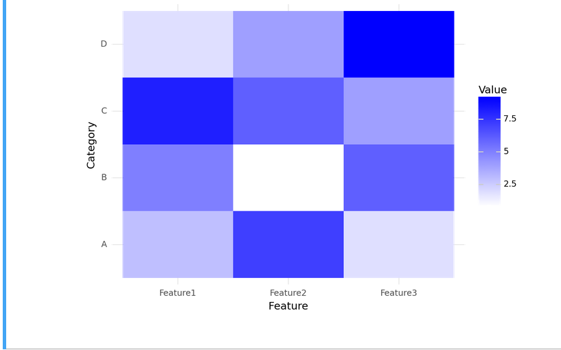
Heatmaps emerge as a powerful tool in the data visualization toolkit. They provide a graphical representation of data in a matrix format, where values are represented by colors. This visual encoding allows for a quick and intuitive understanding of patterns, trends, and variations within the dataset.
Heatmaps leverage color gradients to highlight variations in data, making it easier to identify clusters, trends, or anomalies. The color intensity at each intersection of rows and columns reflects the magnitude of the underlying data, offering a visual summary that is both insightful and accessible.
When dealing with complex datasets, heatmaps excel in providing a concise overview. Whether analyzing gene expression, financial metrics, or any multidimensional data, heatmaps reveal intricate structures and relationships. The ability to spot patterns across multiple dimensions makes heatmaps invaluable for tasks such as clustering, outlier detection, and trend identification.
Now, let’s translate this conceptual understanding into practical implementation using ggplot2 in Python, as we create compelling and informative heatmaps to bring our data to life.
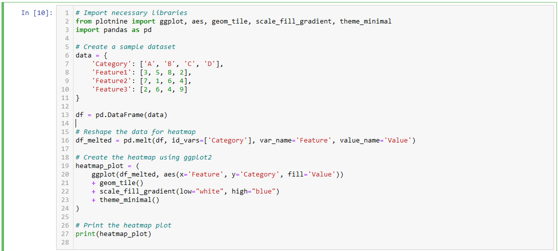
Let’s now dive into a hands-on example, demonstrating the creation of heatmaps using ggplot2 in Python. The following code illustrates a basic heatmap using a synthetic dataset for clarity
Output:
Explanation:
Import Libraries: We import the necessary libraries, including ggplot from the plotnine package and pandas for data manipulation.
Create Sample Dataset: We create a sample dataset with categories (A, B, C, D) and corresponding features.
Reshape Data for Heatmap: The data is reshaped using pd.melt() to fit the requirements of the ggplot2 heatmap.
Create Heatmap with ggplot2: Using ggplot2 syntax, we create a heatmap using geom_tile() to represent each cell and scale_fill_gradient() to define the color gradient.
Display the Heatmap: The resulting heatmap plot is printed.
Feel free to customize the code based on your dataset and specific requirements. This example provides a foundation for creating heatmaps using ggplot2 in Python.
In data visualization with ggplot2, 2D densities play a crucial role in representing the distribution and intensity of data points in a two-dimensional space. Unlike traditional scatter plots, which may become cluttered with overlapping points, 2D densities provide a smooth representation of the data, highlighting regions of high concentration.
The concept of 2D densities involves estimating the probability density function in two dimensions, allowing us to visualize not only the individual data points but also the overall distribution and density patterns within the data.
Let’s dive into a practical example to illustrate the application of 2D densities using ggplot2. We’ll use a synthetic dataset for simplicity:
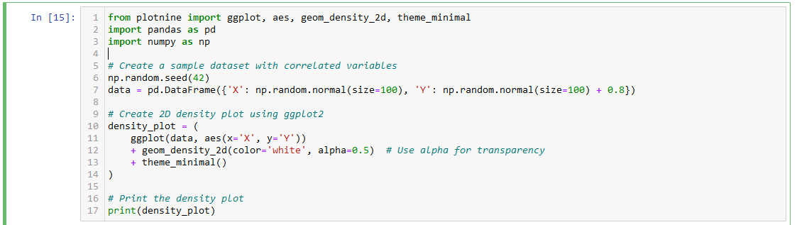
This example generates a 2D density plot using the geom_density_2d() function in ggplot2. The density plot is overlaid on a scatter plot of the data, allowing us to visualize the concentration of points in different regions.
When compared to heatmaps, which provide a grid-based representation of data intensity, 2D density plots offer a continuous and smoother view of the distribution. The contours in a 2D density plot represent regions where data points are more concentrated, aiding in the identification of clusters and trends.
Bivariate Distribution Analysis: 2D densities are valuable in understanding the joint distribution of two variables. This is particularly useful in fields such as finance, where the relationship between risk and return can be explored.
Spatial Analysis: In geographical data visualization, 2D densities help visualize the intensity of events or occurrences across a map, providing insights into spatial patterns.
Biological Data Exploration: In biological studies, 2D density plots are used to analyze the joint distribution of two biomarkers, revealing potential correlations or clusters in complex datasets.
By incorporating 2D densities in your ggplot2 visualizations, you gain a nuanced perspective on the distribution of data points, enabling better-informed decision-making in various real-world scenarios.
Now let us take a look at violin plots and ridgeline plots in ggplot.
In the realm of data visualization with ggplot2, violin plots offer a compelling way to represent the distribution of data. A violin plot combines elements of box plots and kernel density plots, providing a richer visualization of the underlying data distribution.
Let’s walk through some practical examples of creating violin plots using ggplot2 in Python. We’ll use a sample dataset for demonstration:
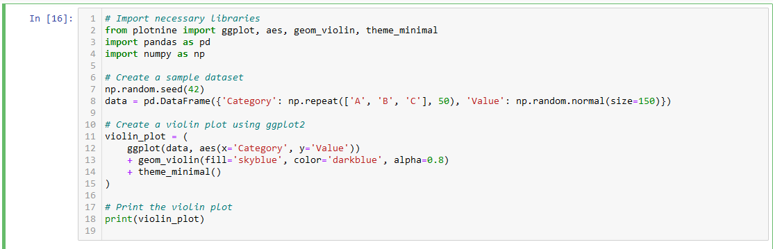
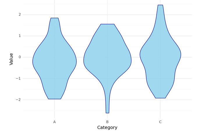
Import Libraries: We import the necessary libraries, including ggplot from the plotnine package and pandas for data manipulation.
Create Sample Dataset: We generate a sample dataset with a categorical variable (‘Category’) and a numerical variable (‘Value’).
Create Violin Plot with ggplot2: Using the geom_violin() function in ggplot2, we create a violin plot. Parameters such as fill (fill color), color (border color), and alpha (transparency) are specified for customization.
Display the Violin Plot: The resulting violin plot is printed, providing a visual representation of the data distribution within each category.
In the dynamic landscape of data visualization using ggplot2, ridgeline plots emerge as a distinctive and engaging technique for conveying multivariate distributions. Also known as joy plots, ridgeline plots provide a layered representation of probability density functions, offering a unique perspective on the distribution of multiple variables.
Ridgeline plots are particularly useful when visualizing the distribution of a numeric variable across different categories or groups. Instead of relying on traditional overlaid histograms or density plots, ridgeline plots elegantly stack multiple distributions, creating a visually appealing and informative display.
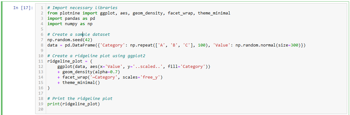
Let’s delve into practical examples to showcase how to implement ridgeline plots using ggplot2 in Python. We’ll use a sample dataset for illustration:
Output:
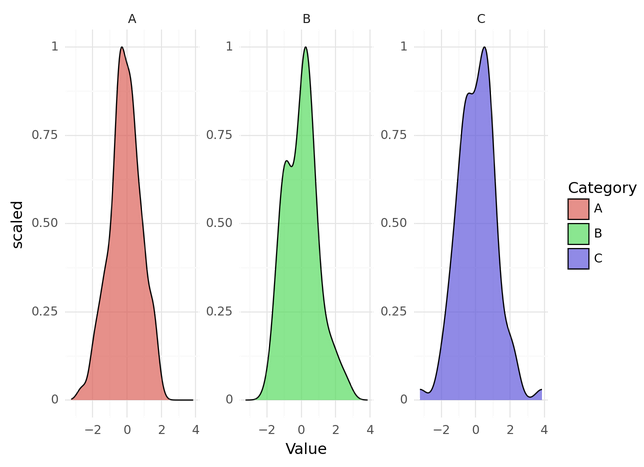
Import Libraries: We import necessary libraries, including ggplot from the plotnine package and pandas for data manipulation.
Create Sample Dataset: We generate a sample dataset with a categorical variable (‘Category’) and a numerical variable (‘Value’).
Create Ridgeline Plot with ggplot2: Using the geom_density() function in ggplot2, we create a ridgeline plot. The facet_wrap() function is employed to arrange the ridgeline plots for each category. Parameters such as alpha control the transparency of the density plots.
Display the Ridgeline Plot: The resulting ridgeline plot is printed, providing a visually rich representation of the distribution of ‘Value’ across different categories.
Feel free to modify this code to suit your dataset and explore additional customization options offered by ggplot2 for creating impactful ridgeline plots.
In the realm of data visualization, choosing the right plot is crucial for effectively communicating insights. Let’s conduct a comparative analysis of two powerful visualization techniques: Violin Plots and Ridgeline Plots. By understanding their strengths and weaknesses, we can identify scenarios where each visualization excels.
Single Variable Comparison: Violin plots are effective when comparing the distribution of a single variable across various categories or groups. For example, comparing the distribution of exam scores across different classes.
Outlier Detection: If identifying outliers and understanding the central tendency of the data are crucial, violin plots provide a clear visual representation of quartiles and medians.
Multivariate Distribution Comparison: Ridgeline plots shine when visualizing the distribution of multiple variables across categories. For instance, exploring the distribution of monthly sales across different product categories.
Smooth Transition Emphasis: In cases where smooth transitions between distributions are important for a visually appealing representation, ridgeline plots offer an elegant solution.
Faceted Arrangement Insights: Ridgeline plots with faceted arrangements provide additional insights into relationships between variables, making them suitable for exploratory data analysis.
By considering the specific characteristics and advantages of each visualization technique, we can make informed decisions based on the nature of the data and the insights we aim to extract. Selecting the right visualization tool enhances our ability to communicate complex patterns and trends effectively.
In the realm of data visualization, network graphs stand out as powerful tools for unraveling complex relationships. Let’s delve into a conceptual overview of network graphs, exploring their significance in representing intricate connections within datasets.
Network graphs, also known as graphs or networks, provide a visual representation of relationships between entities. In a network graph, entities are represented as nodes, and the connections between them are depicted as edges. This structure enables the visualization of complex systems, where entities interact, collaborate, or influence one another.
1. Clarity in Connectivity:
2. Pattern Recognition:
3. Community Detection:
4. Centrality Analysis:
5. Dynamic Interaction Visualization:
Creating network graphs using ggplot2 in Python involves using the networkx library to generate the graph and plotnine for the actual plotting. Here’s a code walkthrough with explanations
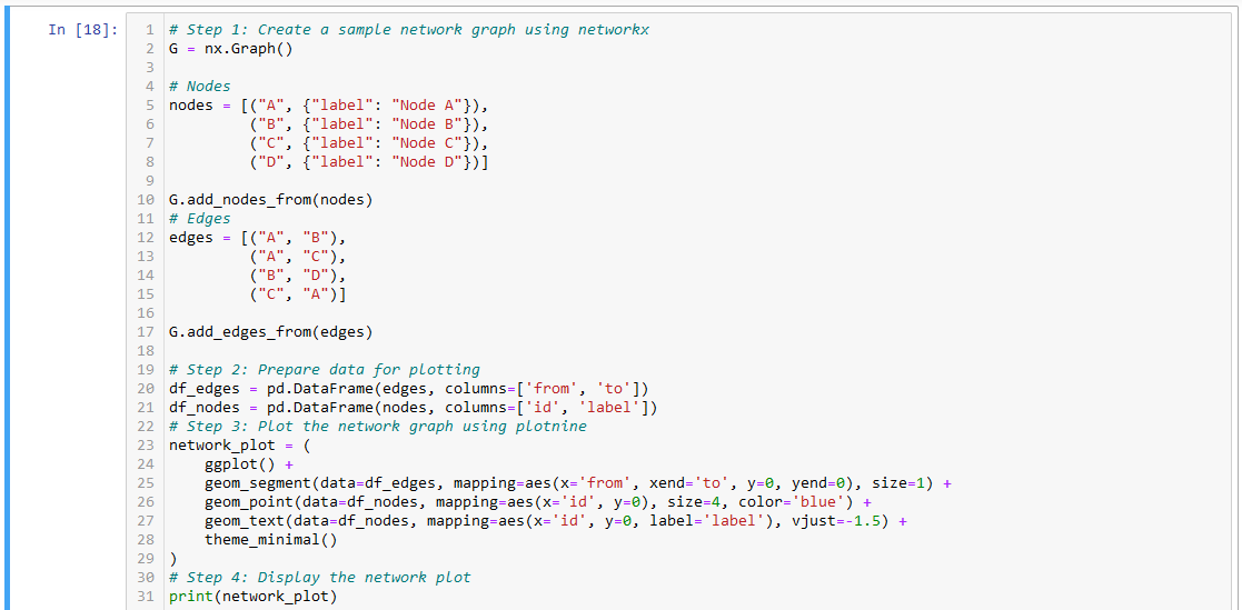
Create Network Graph with networkx:
networkx.Prepare Data for Plotting:
plotnine to plot the graph.Plot the Network Graph with plotnine:
plotnine functions to create segments for edges, points for nodes, and text labels for node names.Customization:
Display the Plot:
Feel free to customize the code further based on your specific dataset and visualization preferences. Adjusting parameters in plotnine and networkx allows for a wide range of customization options for network graph visualizations in Python.
When it comes to visualizing complex relationships and connections, network graphs provide a powerful solution. In this section, we will explore key features and advanced customization options in ggplot2 for creating compelling network visualizations. Additionally, we’ll share tips for enhancing clarity and visual appeal in your network graphs.
Node and Edge Aesthetics:
Utilize the geom_node_point() and geom_edge_link() functions to customize the appearance of nodes and edges. Adjust parameters such as size, color, and shape to emphasize specific elements.
2. Labeling Nodes:
Enhance readability by adding labels to nodes using geom_node_text(). This is particularly useful when nodes represent entities or key data points.
3. Color Mapping:
Apply color mapping to nodes or edges based on specific attributes. Use scale_color_manual() to define a custom color palette that provides additional information within the graph.
4. Layout Algorithms:
Experiment with different layout algorithms to control the spatial arrangement of nodes. Common layout options include Fruchterman-Reingold ('fr') and Kamada-Kawai ('kk').
5. Edge Curvature:
Introduce curvature to edges using the geom_edge_link(curvature=...) parameter. This can improve the visual flow of the network graph.
6. Interactive Visualizations:
Enhance user engagement by incorporating interactivity. Explore libraries like plotly for creating interactive network visualizations with features such as hover information and zoom capabilities.
Node Size and Centrality:
Adjust node size based on centrality metrics using geom_node_point(aes(size=...)). This highlights the importance of specific nodes within the network.
2. Color Harmony:
Ensure a harmonious color scheme to improve overall aesthetics. Consider using color gradients or categorical color palettes that align with the nature of your data.
3. Faceting for Insightful Comparisons:
Utilize faceting with facet_grid() or facet_wrap() to create multiple panels, enabling comparisons across different subsets of the network.
4. Clear Node Labeling:
Opt for clear and concise node labeling to avoid clutter. Adjust the positioning and size of labels to enhance visibility.
5. Consider Edge Transparency:
Introduce transparency to edges using the alpha parameter. This can be beneficial when dealing with overlapping connections.
By leveraging the advanced features and customization options in ggplot2, you can create network graphs that effectively communicate complex relationships and patterns within your data. Experiment with different parameters, layouts, and interactive elements to tailor your network visualizations to the specific insights you aim to convey.
Node Size and Centrality:
Adjust node size based on centrality metrics using geom_node_point(aes(size=...)). This highlights the importance of specific nodes within the network.
2. Color Harmony:
Ensure a harmonious color scheme to improve overall aesthetics. Consider using color gradients or categorical color palettes that align with the nature of your data.
3. Faceting for Insightful Comparisons:
Utilize faceting with facet_grid() or facet_wrap() to create multiple panels, enabling comparisons across different subsets of the network.
4. Clear Node Labeling:
Opt for clear and concise node labeling to avoid clutter. Adjust the positioning and size of labels to enhance visibility.
5. Consider Edge Transparency:
Introduce transparency to edges using the alpha parameter. This can be beneficial when dealing with overlapping connections.
By leveraging the advanced features and customization options in ggplot2, you can create network graphs that effectively communicate complex relationships and patterns within your data. Experiment with different parameters, layouts, and interactive elements to tailor your network visualizations to the specific insights you aim to convey.
In the realm of data visualization, Sunburst and Treemap visualizations stand out as effective techniques for representing hierarchical data structures. In this section, we’ll provide an active voice overview of these visualizations, highlighting their features and discussing the advantages of utilizing ggplot2 for hierarchical data representation.
Sunburst Visualization:
Representation: Sunburst visualizations display hierarchical data in a radial, multilevel pie chart. Each level of the hierarchy is represented by concentric rings, making it visually intuitive to explore the relationship between parent and child categories.
Advantages:
Treemap Visualization:
Representation: Treemap visualizations use nested rectangles to represent hierarchical data. Each rectangle’s size corresponds to the proportion of the data it represents within the entire hierarchy.
Advantages:
1. Flexible Customization:
ggplot2 provides a high level of customization, allowing users to adapt the aesthetics of Sunburst and Treemap visualizations based on specific data and visualization requirements.
2. Consistent Grammar of Graphics:
Leveraging the grammar of graphics concept in ggplot2 ensures a consistent and coherent approach to building hierarchical visualizations. This enables users to create complex yet cohesive plots.
3. Facilitation of Storytelling:
With ggplot2, users can create dynamic and interactive visualizations that enhance storytelling. This is particularly valuable when presenting insights from hierarchical data to diverse audiences.
4. Seamless Integration with R Ecosystem:
As part of the R ecosystem, ggplot2 seamlessly integrates with other R libraries and tools, facilitating a comprehensive and unified approach to data analysis and visualization.
5. Extensive Community Support:
The ggplot2 community offers a wealth of resources, tutorials, and expertise, making it easier for users to explore, troubleshoot, and expand their knowledge in hierarchical data visualization.
By employing ggplot2 for Sunburst and Treemap visualizations, users can harness the flexibility and robustness of this visualization library, enabling the creation of insightful and visually engaging representations of hierarchical data structures. As we proceed, we’ll delve into practical implementations and hands-on examples to illustrate the power of ggplot2 in bringing hierarchical data to life.
Clear and well-designed legends play a crucial role in effective data communication. They serve as a guide for interpreting the colors, shapes, and sizes in a plot, enhancing the overall understanding of the visualized data.
Significance of Clear Legends for Effective Communication
A clear legend aids in conveying the meaning behind different elements in a plot, making it easier for the audience to interpret the data accurately. Misinterpretation can be avoided, and the viewer can focus on the insights rather than struggling to understand the representation.
Impact of Well-Designed Legends on the Overall Interpretation of Visualizations
Well-designed legends contribute to the overall clarity and aesthetics of a plot. They provide context and help the audience associate visual elements with specific data categories, leading to a more accurate and insightful interpretation of the visualization.
In ggplot2, there are several techniques for customizing legends to meet specific requirements:
Adjusting Legend Titles and Labels:
Adjusting Legend Titles and Labels:
There’s no denying the fact that possessing computer skills is a big plus point for everyone looking for a job nowadays. Almost every sector uses computers nowadays. So, if you have enough computer skills, the chances of you getting your dream job to improve a lot. So, if you want to excel in computer skills, you should consider reading the above-mentioned books as they’ll surely benefit you.


We provide online certification in Data Science and AI, Digital Marketing, Data Analytics with a job guarantee program. For more information, contact us today!
Courses
1stepGrow
Anaconda | Jupyter Notebook | Git & GitHub (Version Control Systems) | Python Programming Language | R Programming Langauage | Linear Algebra & Statistics | ANOVA | Hypothesis Testing | Machine Learning | Data Cleaning | Data Wrangling | Feature Engineering | Exploratory Data Analytics (EDA) | ML Algorithms | Linear Regression | Logistic Regression | Decision Tree | Random Forest | Bagging & Boosting | PCA | SVM | Time Series Analysis | Natural Language Processing (NLP) | NLTK | Deep Learning | Neural Networks | Computer Vision | Reinforcement Learning | ANN | CNN | RNN | LSTM | Facebook Prophet | SQL | MongoDB | Advance Excel for Data Science | BI Tools | Tableau | Power BI | Big Data | Hadoop | Apache Spark | Azure Datalake | Cloud Deployment | AWS | GCP | AGILE & SCRUM | Data Science Capstone Projects | ML Capstone Projects | AI Capstone Projects | Domain Training | Business Analytics
WordPress | Elementor | On-Page SEO | Off-Page SEO | Technical SEO | Content SEO | SEM | PPC | Social Media Marketing | Email Marketing | Inbound Marketing | Web Analytics | Facebook Marketing | Mobile App Marketing | Content Marketing | YouTube Marketing | Google My Business (GMB) | CRM | Affiliate Marketing | Influencer Marketing | WordPress Website Development | AI in Digital Marketing | Portfolio Creation for Digital Marketing profile | Digital Marketing Capstone Projects
Jupyter Notebook | Git & GitHub | Python | Linear Algebra & Statistics | ANOVA | Hypothesis Testing | Machine Learning | Data Cleaning | Data Wrangling | Feature Engineering | Exploratory Data Analytics (EDA) | ML Algorithms | Linear Regression | Logistic Regression | Decision Tree | Random Forest | Bagging & Boosting | PCA | SVM | Time Series Analysis | Natural Language Processing (NLP) | NLTK | SQL | MongoDB | Advance Excel for Data Science | Alteryx | BI Tools | Tableau | Power BI | Big Data | Hadoop | Apache Spark | Azure Datalake | Cloud Deployment | AWS | GCP | AGILE & SCRUM | Data Analytics Capstone Projects
Anjanapura | Arekere | Basavanagudi | Basaveshwara Nagar | Begur | Bellandur | Bommanahalli | Bommasandra | BTM Layout | CV Raman Nagar | Electronic City | Girinagar | Gottigere | Hebbal | Hoodi | HSR Layout | Hulimavu | Indira Nagar | Jalahalli | Jayanagar | J. P. Nagar | Kamakshipalya | Kalyan Nagar | Kammanahalli | Kengeri | Koramangala | Kothnur | Krishnarajapuram | Kumaraswamy Layout | Lingarajapuram | Mahadevapura | Mahalakshmi Layout | Malleshwaram | Marathahalli | Mathikere | Nagarbhavi | Nandini Layout | Nayandahalli | Padmanabhanagar | Peenya | Pete Area | Rajaji Nagar | Rajarajeshwari Nagar | Ramamurthy Nagar | R. T. Nagar | Sadashivanagar | Seshadripuram | Shivajinagar | Ulsoor | Uttarahalli | Varthur | Vasanth Nagar | Vidyaranyapura | Vijayanagar | White Field | Yelahanka | Yeshwanthpur
Mumbai | Pune | Nagpur | Delhi | Gurugram | Chennai | Hyderabad | Coimbatore | Bhubaneswar | Kolkata | Indore | Jaipur and More