


Welcome to the pinnacle of our data visualization journey— “Advanced Visualizations with Plotly: Plotly Part 3.” In this thrilling installment, we transcend the ordinary, delving into the dynamic landscapes of Plotly’s advanced features. As we harness the full potential of this versatile tool, we invite you to join us on an exploration that goes beyond the conventional, into the realm of sophisticated visual storytelling.
This blog post is more than just a guide; it’s an immersive experience. We embark on a voyage through the intricacies of geographical plots, unlocking the secrets of dynamic storytelling with animated visualizations, and constructing interactive dashboards using the powerful Dash framework. The main keyword, “Advanced Visualizations with Plotly,” serves as our gateway into a world where data transforms into vibrant, compelling narratives.

Our journey doesn’t stop at the creation of stunning visuals; we address performance optimization, troubleshooting common pitfalls, and seamlessly integrating Plotly with other data science libraries. As we navigate through these advanced techniques, each section unfolds a new dimension of Plotly’s capabilities, empowering you to craft narratives that resonate and captivate.
So, buckle up as we traverse the intricate landscapes of Plotly’s advanced functionalities. Together, let’s unveil the secrets, master the techniques, and transform your data visualizations into powerful, persuasive stories. This is more than a blog post; it’s an invitation to elevate your data storytelling game. Let the exploration begin!
In this section, we delve into the intricacies of Plotly’s geographical data visualization capabilities, empowering you to convey spatial insights with precision and flair.
Geographical plots offer a unique lens through which we can understand and communicate data patterns in a spatial context. Plotly, with its dynamic and interactive features, takes geographical data visualization to new heights. Whether you’re mapping global trends, regional variations, or pinpointing specific locations, Plotly provides a versatile toolkit.
To kickstart your exploration, let’s consider an example. Suppose we have a dataset containing information about cities worldwide—their populations, coordinates, and key attributes. We can employ Plotly to create an interactive map that not only showcases these cities but also allows users to interact with and explore data points effortlessly.
Importing Plotly Express:
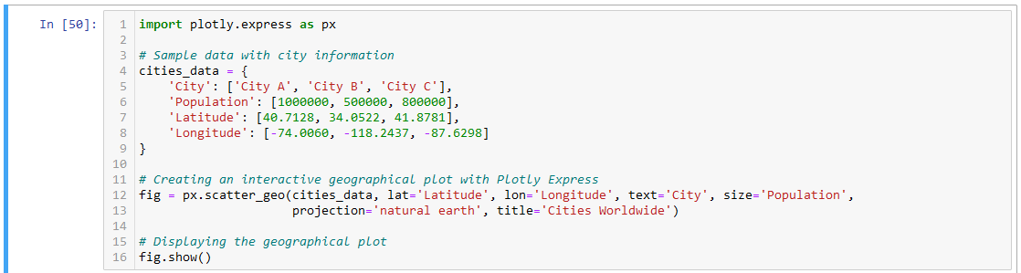
import plotly.express as px: This line imports the Plotly Express library and aliases it as px, allowing us to use the shorthand px throughout the code.Creating Sample Data:
cities_data: This dictionary represents sample data with information about three cities—City A, City B, and City C. It includes the city names ('City'), population ('Population'), latitude ('Latitude'), and longitude ('Longitude').Creating an Interactive Geographical Plot:
fig = px.scatter_geo(...): This line uses Plotly Express to create an interactive geographical scatter plot. The key parameters include:cities_data: The dataset containing city information.lat='Latitude' and lon='Longitude': Specifies that latitude and longitude columns from the dataset will be used for plotting the cities.text='City': Associates the city names as text labels that will appear when hovering over the data points.size='Population': The size of each marker is determined by the population of the respective city.projection='natural earth': Defines the map projection, in this case, a natural earth view.title='Cities Worldwide': Sets the title of the plot.Displaying the Geographical Plot:
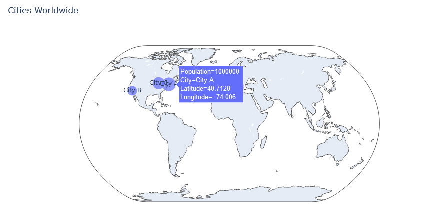
fig.show(): This line displays the created geographical plot with all the specified parameters. The plot will appear in a separate window or output cell, depending on the environment in which the code is executed.By running this code, you generate an interactive geographical scatter plot showcasing City A, City B, and City C on a world map. The markers’ sizes represent the population of each city, and additional details appear when hovering over the markers. This example illustrates how Plotly Express simplifies the creation of complex visualizations with minimal code.
Plotly’s geographical plots offer more than just static representations; they provide an interactive canvas for exploration. Users can zoom in, hover over data points for details, and gain a comprehensive understanding of spatial relationships. Additionally, Plotly supports various map projections, allowing you to tailor the visual representation to your specific needs.
With Plotly, your geographical plots become dynamic canvases. Users can interactively explore data points, zooming in for detailed views or panning across regions for a broader perspective. This level of interactivity adds depth to your visualizations, engaging your audience and facilitating a deeper understanding of the spatial context.
Tailor your geographical plots to match your storytelling style. Plotly allows customization of markers, colors, and annotations, enabling you to convey your message with clarity. Whether you’re emphasizing specific regions, highlighting key data points, or incorporating custom legends, Plotly’s versatility empowers you to create visuals that resonate.
Plotly supports multiple map projections, allowing you to choose the most suitable representation for your data. Whether you opt for a world view, regional focus, or a specific projection tailored to your dataset, Plotly provides the flexibility needed to present geographical information accurately.
As you venture into geographical plots with Plotly, consider the unique aspects of your dataset and the insights you aim to convey. The combination of interactive exploration, customization options, and varied map projections positions Plotly as a powerful tool for unlocking the potential of geographical data visualization.
Now let us take a look at how to create a map plot step by step.
Embark on a detailed journey as we navigate through the process of plotting data points on maps using Plotly. This step-by-step guide ensures you not only visualize your geographical data effectively but also harness the full potential of customization options for an engaging and insightful map.
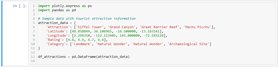
Begin by importing the necessary libraries and organizing your dataset. Let’s consider a dataset with information about tourist attractions, including their names, locations (latitude and longitude), visitor ratings, and category.
Utilize Plotly Express to generate an interactive map. Specify the latitude and longitude columns, and consider incorporating additional variables such as size (based on ratings) and color (based on category) to enhance the visualization.

Enhance the visual appeal of your map by customizing various elements. Tailor the appearance of markers, adjust color schemes, and include annotations to provide context.

Showcase your interactive map using the show() function. This will render the map, allowing you to explore data points, zoom in, and interactively engage with the geographical visualization.
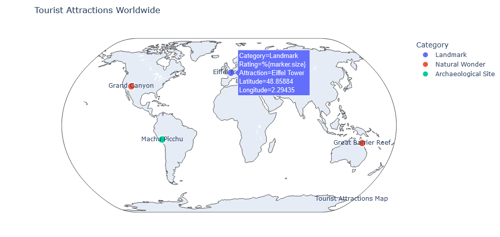
Through this detailed guide, you’ve not only plotted data on a map but also delved into customization options, making your geographical visualizations more compelling. Plotly’s versatility allows you to transform location-based datasets into immersive and interactive maps, providing valuable insights and a visually engaging experience for your audience.
In the expansive landscape of data visualization, animated elements stand as dynamic storytellers, breathing life into static datasets. Plotly, a versatile visualization library, empowers creators to transform their narratives through animated visualizations. In this section, we delve into the profound significance of animated visuals, exploring their impact on data storytelling. Additionally, we guide you through the process of seamlessly incorporating animations into line charts and scatter plots, ushering in a new era of dynamic exploration and engagement.
Animated visualizations transcend the constraints of static graphics, offering a compelling way to communicate data narratives. By introducing a temporal dimension, animations enable the depiction of trends, changes, and sequences, captivating audiences in a way static visuals cannot. Plotly, with its user-friendly interface and robust capabilities, emerges as a catalyst for infusing datasets with motion and narrative depth.
Temporal Evolution: Animated visualizations provide a chronological sequence, allowing viewers to witness the evolution of data over time. This temporal context facilitates a nuanced understanding of trends, patterns, and fluctuations.
Emphasizing Transitions: Changes in data are often more impactful when witnessed in motion. Animations highlight transitions, making it easier for audiences to discern shifts, peaks, and troughs, fostering a more intuitive comprehension of data dynamics.
Guiding Viewer Focus: Animations guide the viewer’s focus, drawing attention to specific elements or phases of the data. This controlled narrative flow ensures that critical insights are not overlooked, fostering a more comprehensive interpretation.
Line charts, renowned for their ability to illustrate trends over time, will be transformed into animated narratives, unraveling the monthly sales progression for a product. Let’s delve into the intricacies of the code, witnessing how each frame breathes life into the data, creating a compelling visual story.
Line charts serve as invaluable tools for portraying temporal trends, making them ideal candidates for animation. By animating a line chart representing monthly sales, we gain a nuanced understanding of how sales evolve over the course of several months. Each frame in the animation captures a specific month, allowing us to witness the ebb and flow of sales dynamics.
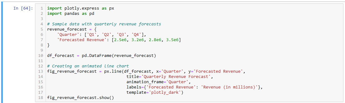
Import Libraries: We start by importing Plotly Express and pandas, setting the stage for our advanced line chart creation.
Data Preparation: Our dataset, revenue_forecast, includes quarterly revenue forecasts. The data is organized into a Pandas DataFrame, df_forecast, making it ready for visualization.
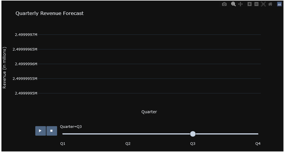
Animating the Line Chart: Using px.line(), we craft an animated line chart. The x and y parameters define the axes, animation_frame specifies the variable to animate (in this case, ‘Quarter’), and additional styling options like labels and templates enhance the visual appeal.
In this example, the animated line chart dynamically evolves month by month, providing a clear visual representation of the sales progression over time. Each frame becomes a snapshot of a specific month, contributing to the unfolding narrative.
Animated scatter plots offer an immersive exploration of data points and trends, adding an extra layer of dynamism to your storytelling. Consider a dataset with the performance of various products over quarters.
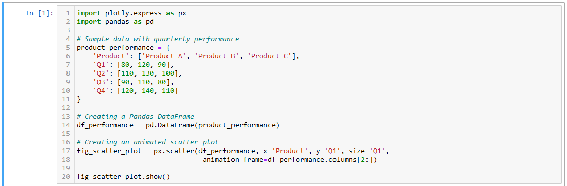
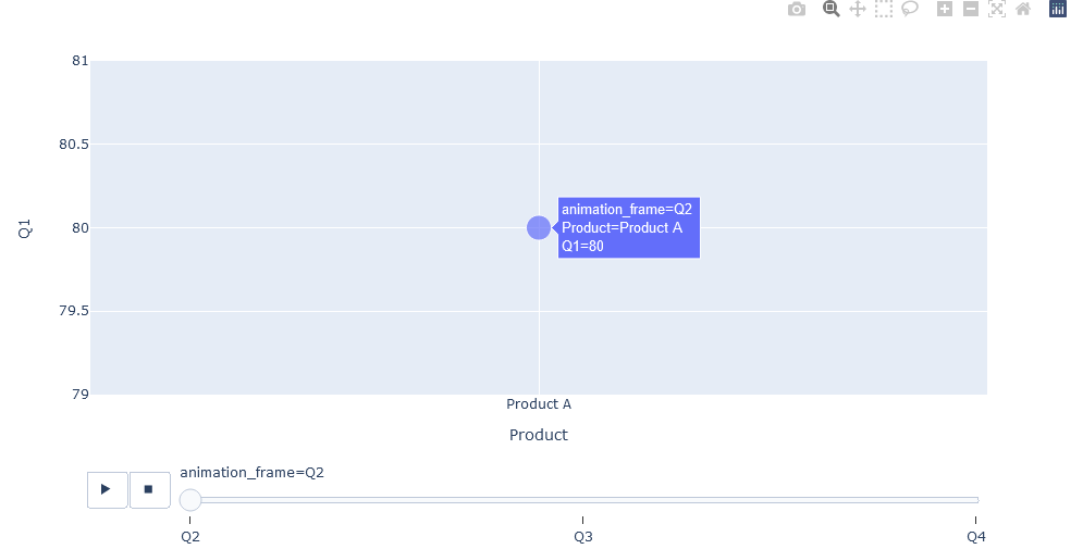
product_performance. This dataset includes information about the performance of three products (Product A, Product B, and Product C) across four quarters (Q1, Q2, Q3, Q4).df_performance. DataFrames are convenient structures for organizing and manipulating tabular data.px.scatter(): This function from Plotly Express is used to create a scatter plot. The parameters within this function define the data source (df_performance), the x-axis ('Product'), the y-axis ('Q1'), and the size of the markers ('Q1').animation_frame: This parameter is set to df_performance.columns[2:], indicating that the animation frames will be generated for the columns starting from the third column (‘Q2’) to the end. This results in the animation transitioning through the quarterly performance data.In summary, the code generates an animated scatter plot where each frame corresponds to a different quarter, dynamically showcasing the performance of three products. The size of the markers is determined by the values in the ‘Q1’ column, adding an extra layer of information to the visualization. As the animation progresses, viewers can observe how the performance of each product changes across
As we conclude our exploration of animated visualizations with Plotly, it becomes evident that the art of storytelling extends beyond static images. Animated elements elevate data narratives, fostering a deeper connection with the audience through dynamic exploration. Consider the following aspects to master the art of animated storytelling:
Strategic Animation Duration: Adjust the duration of each animation frame to strike a balance between engagement and comprehension. Experiment with durations to find the optimal rhythm for your narrative.
Interactivity and Exploration: Leverage Plotly’s interactive features alongside animations. Allow users to pause, rewind, or explore specific frames, empowering them to engage with the data at their own pace.
Data-Driven Annotations: Integrate annotations into animated visualizations to provide context and highlight key points. Annotations guide the audience, ensuring that the significance of each frame is fully appreciated.
Transitions and Easing Functions: Explore different transition styles and easing functions to add subtlety and smoothness to animations. A well-crafted transition enhances the visual experience, making it more pleasing to the eye.
In the ever-evolving landscape of web development, Dash emerges as a dynamic framework, seamlessly blending the power of Python with interactive web applications. This section provides an exhaustive overview of Dash, delving into its fundamental concepts, installation processes, and the potential it unlocks for creating engaging and responsive web interfaces.
Dash is an open-source Python framework designed for building interactive, web-based data visualizations, dashboards, and analytical applications. Developed by Plotly, Dash empowers developers and data scientists to create robust and customizable web applications using familiar Python libraries.
Declarative Syntax: Dash follows a declarative syntax, allowing developers to describe the structure and behavior of their web applications using Python code, minimizing the need for HTML, CSS, or JavaScript.
Component-Based Architecture: Dash applications are built using modular components, making it easy to organize and structure complex applications. Components can include interactive plots, dropdowns, sliders, and more.
Interactivity and Real-Time Updates: Dash enables real-time updates and interactivity without the need for manual page refreshes. Users can dynamically interact with the application, triggering updates and responses in real-time.
Integration with Plotly: Dash seamlessly integrates with Plotly, extending its capabilities to create interactive and visually appealing data visualizations.
To embark on your Dash journey, the first step is to install the Dash library. Open your terminal or command prompt and execute the following command:
pip install dash
If you want to install dash on your jupyter notebook write the following command:
!pip install dash
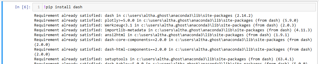
This command installs the Dash library along with its dependencies, laying the foundation for building web applications.
Let’s walk through a simple example of creating a Dash application. The code snippet below initializes a Dash app, defines a basic layout with a heading and an interactive bar chart, and runs the app directly within the Jupyter Notebook.
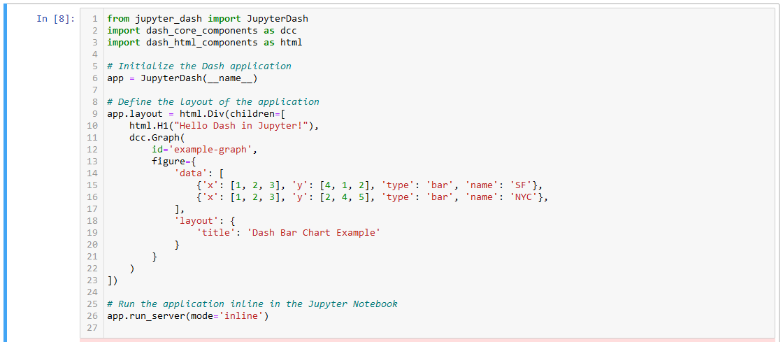
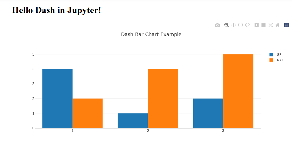
from jupyter_dash import JupyterDash: Imports the JupyterDash class from the jupyter_dash module, allowing for the integration of Dash with Jupyter Notebooks.import dash_core_components as dcc: Imports the core components module of Dash, including components for creating interactive visualizations.import dash_html_components as html: Imports the HTML components module of Dash, which is used to structure the layout of the application.app = JupyterDash(__name__): Creates an instance of the JupyterDash class, initializing the Dash application. The __name__ argument is used to identify the main module.app.layout: Defines the layout of the Dash application. In this example, it consists of a html.Div (HTML division) containing an html.H1 (HTML heading level 1) and a dcc.Graph (Plotly graph component). This structure forms the basic layout of the application.dcc.Graph: Configures an interactive graph component using Plotly. The figure property of the graph is set with sample data for two bar plots representing cities SF and NYC.app.run_server(mode='inline'): Initiates the Dash application and runs it inline within the Jupyter Notebook. The mode='inline' parameter ensures that the application is displayed directly within the notebook.Congratulations! You’ve successfully set up and run your inaugural Dash application. This serves as the foundation for exploring more advanced features, creating dynamic dashboards, and integrating interactivity into your data visualizations. As we progress through this journey, each step with Dash unlocks new possibilities, allowing you to craft immersive web applications with the power of Python. Stay tuned for more insights and hands-on experiences with Dash in the upcoming sections.
This section provides a comprehensive step-by-step guide to creating an engaging and dynamic dashboard using the powerful features of Dash.
When venturing into the realm of creating interactive dashboards with Dash, the first crucial step is to initialize your Dash application. This foundational process sets the stage for crafting dynamic and engaging web applications directly within your Jupyter Notebook. Let’s delve into the details of initializing a Dash app and the essential libraries and modules required.
Initializing a Dash application involves creating an instance of the JupyterDash class, which is specifically designed to seamlessly integrate Dash within the Jupyter environment. This class inherits from the standard Dash class but is tailored for interactive use within notebooks.
To start the initialization process, consider the following steps:
Before we begin, ensure that you have the required libraries and modules installed. At the heart of this process is the JupyterDash class, which enables the integration of Dash components into your Jupyter Notebook. Import this class by using the following:
Before we begin, ensure that you have the required libraries and modules installed. At the heart of this process is the JupyterDash class, which enables the integration of Dash components into your Jupyter Notebook. Import this class by using the following:
from jupyter_dash import JupyterDash
Additionally, you may need to import other components based on the functionalities you plan to incorporate into your application. Common imports include:
import dash_core_components as dcc
import dash_html_components as html
These imports enable you to leverage core components for building interactive visualizations and HTML components for structuring your dashboard layout.
Let’s put the theory into practice with a simple example:

In this example, we create an instance of the JupyterDash class named app. This instance becomes the foundation on which you’ll build your interactive dashboard.
By initializing your Dash application, you’ve laid the groundwork for constructing an immersive and dynamic web-based dashboard. This fundamental step, combined with the right imports, unlocks the potential to seamlessly integrate interactive visualizations into your Jupyter Notebook environment. As we progress through this journey, stay tuned for further insights into structuring layouts, adding interactive components, and creating visually compelling dashboards.
Once your Dash application is initialized, the next pivotal step is structuring the layout of your dashboard within the Jupyter Notebook environment. This process involves creating a visual foundation for your interactive application, and Dash provides flexibility by allowing you to utilize HTML components for seamless structuring. Let’s dive into the intricacies of crafting a well-structured layout.
To begin, you’ll create a layout for your dashboard by defining a structure that encapsulates the arrangement of components. Dash applications are built using a hierarchy of HTML components, forming a tree-like structure.

The html.Div component acts as a container for other components, providing a structured layout.
Dash leverages HTML components to structure the visual layout of your application. These components include headings, paragraphs, divs, and more. For instance, you can use html.H1 for a top-level heading:

Dash leverages HTML components to structure the visual layout of your application. These components include headings, paragraphs, divs, and more. For instance, you can use html.H1 for a top-level heading:
Let’s incorporate these concepts into a practical example:
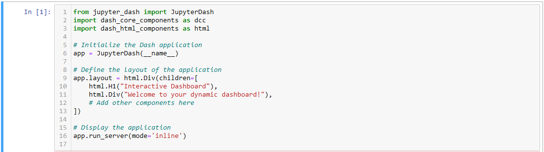

In this example, we’ve created a simple layout structure with an H1 heading and a div containing a welcome message. This serves as the foundation upon which you can build a more complex and interactive dashboard.
In this section, we delve into the realm of enhancing interactivity within your Jupyter Dashboard using Dash. Interactive components play a pivotal role in providing users with dynamic control over data visualization. We’ll explore the introduction and incorporation of sliders for seamless data filtering, followed by the utilization of dropdown components to facilitate dynamic selections. These components empower users to interact with and tailor visualizations according to their preferences, creating a more immersive and personalized dashboard experience. Let’s embark on this journey of interactivity within the Jupyter environment and unlock the potential for dynamic data exploration and visualization.
Enhancing the interactivity of your Jupyter Dashboard involves introducing intuitive components, and sliders are key players in providing users with dynamic control over data filtering. In this section, we’ll explore the seamless integration of sliders within Dash in Jupyter, allowing you to directly embed these interactive elements into your notebook. Let’s dive into the details of leveraging sliders for interactive data filtering.
Dash offers a user-friendly approach to incorporating sliders, making it accessible within the Jupyter environment. Sliders provide a visually intuitive way for users to interact with your data, adjusting parameters dynamically. They are versatile components, commonly used for numerical input, date selection, or any variable that requires continuous adjustment.
Dash offers a user-friendly approach to incorporating sliders, making it accessible within the Jupyter environment. Sliders provide a visually intuitive way for users to interact with your data, adjusting parameters dynamically. They are versatile components, commonly used for numerical input, date selection, or any variable that requires continuous adjustment.
from jupyter_dash import JupyterDash
import dash_core_components as dcc
import dash_html_components as html

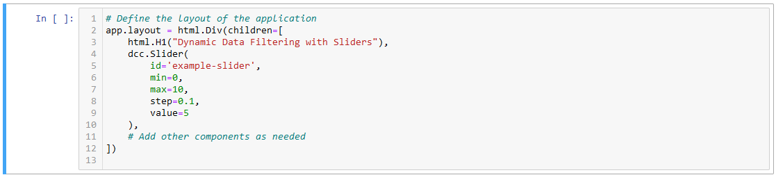
html.Div(children=[...]):
Creates a Div component, which acts as a container for other HTML components within the layout.
html.H1("Dynamic Data Filtering with Sliders"):
Adds an H1 (heading level 1) HTML component displaying the text “Dynamic Data Filtering with Sliders.”
dcc.Slider(id='example-slider', min=0, max=10, step=0.1, value=5):
Integrates a Dash Core Component (dcc.Slider) into the layout.
id='example-slider': Assigns a unique identifier to the slider.
min=0, max=10: Sets the minimum and maximum values of the slider.
step=0.1: Defines the step size for slider movement.
value=5: Specifies the initial/default value of the slider.

This callback function reacts to changes in the slider’s value, updating the associated graph accordingly.
By incorporating sliders directly into your Jupyter Dashboard using Dash, you’ve empowered users to dynamically filter and explore data with ease. Sliders provide an interactive and visually engaging way to enhance user control over data visualization parameters. As we progress, we’ll explore more interactive components, enabling you to create a fully immersive and responsive dashboard experience. Stay tuned for further insights and advancements in our Dash blog series!
Expanding the horizon of interactivity within your Jupyter Dashboard involves harnessing the power of dropdown components. Dropdowns provide an intuitive way for users to make dynamic selections, offering a seamless experience. In this section, we’ll explore the incorporation of dropdowns into your Dash application, connecting them to update graphs and visualizations in real-time.
Dropdowns, a fundamental interactive component in Dash, enable users to choose from a list of options dynamically. This versatile tool finds its application in scenarios where users need to filter, categorize, or explore specific subsets of data. Let’s delve into the process of integrating dropdowns into your Jupyter Dashboard.
from dash_core_components import Dropdown
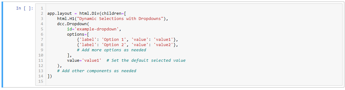
The options parameter defines the dropdown menu options, each with a label and corresponding value.

This callback function reacts to changes in the dropdown’s selected value, triggering updates in associated components.
As users interact with the dropdown, the specified callback function (update_graph) dynamically responds, allowing for real-time updates to the displayed graph or visualization. This seamless connection between dropdowns and visualizations enhances the exploratory nature of your Jupyter Dashboard, providing users with an engaging and interactive experience.
In the next example, we’ll illustrate the incorporation of dropdowns into a Jupyter Dashboard, showcasing their role in facilitating dynamic selections and real-time updates to visualizations. Stay tuned for a hands-on demonstration of this powerful feature!
Elevate the efficiency of your Plotly visualizations and Dashboards by implementing strategic optimizations. In this section, we’ll delve into valuable tips and techniques to enhance the performance of your data-driven applications, ensuring a seamless and responsive user experience.
Data Aggregation and Sampling: Employ data aggregation techniques to summarize large datasets, providing an overview without compromising granularity. Additionally, consider incorporating data sampling methods to extract representative subsets for visualization.
Pagination and Lazy Loading: Implement pagination or lazy loading mechanisms for Dashboards displaying extensive datasets. This ensures that only relevant portions of the data are loaded as users navigate through different sections.
Caching for Reusability: Leverage caching mechanisms to store and reuse computed results. This proves particularly beneficial for computations or data processing steps that remain consistent across multiple interactions.
By implementing these performance optimization strategies, you’ll elevate your Plotly visualizations and Dashboards to deliver a perfected user experience. Whether you’re working with intricate plots or handling substantial datasets, these tips will guide you in achieving optimal responsiveness and efficiency. Stay tuned for further insights into seamlessly integrating Plotly with other powerful libraries and troubleshooting common challenges in our ongoing exploration of advanced topics in Plotly.
Embarking on your journey with Plotly may occasionally lead to encounters with common errors and challenges. Fear not! In this section, we’ll delve into effective troubleshooting techniques and share valuable resources to guide you through resolving Plotly-related issues.
Browser Compatibility: Cross-verify the compatibility of your web browser with Plotly Dash. Some features may exhibit inconsistencies across different browsers. Switching browsers or updating to the latest version often resolves rendering issues.
Callback Debugging: When dealing with callbacks, use debugging techniques to identify issues. Print statements within your callback functions or utilize Dash’s debugging features to pinpoint the source of unexpected behavior.
Official Plotly Documentation: The Plotly documentation serves as a comprehensive resource. Refer to it for detailed explanations, examples, and troubleshooting guidance.
Community Forums: Engage with the Plotly community through forums and discussion platforms. Users often share insights into common issues and collaborate on problem-solving. The Plotly Community Forum is a valuable hub for discussions.
GitHub Repositories: Explore GitHub repositories for Plotly and related libraries. Developers frequently report and resolve issues on these platforms. GitHub issues pages are an excellent source of real-world problem-solving scenarios.
In wrapping up our Plotly journey, you’ve unlocked a treasure trove of data visualization prowess. From foundational insights to crafting interactive Dashboards, you’ve dived deep into the world of Plotly.
Key Takeaways:
Plotly’s Versatility: Explore the power of Plotly across programming languages, crafting dynamic visualizations tailored to your data needs.
Dash for Interactivity: Extend your capabilities with Dash, seamlessly building interactive web applications and dashboards.
Performance Optimizations: Learn strategies to optimize visualization performance, balancing interactivity with large datasets.
Troubleshooting Mastery: Equip yourself with troubleshooting skills, utilizing resources like documentation, forums, and GitHub.
As you continue your data visualization journey, Plotly stands as a dynamic companion, offering endless possibilities for turning data into captivating stories. Embrace the creativity Plotly fuels in your visual narratives. If you enjoy the blog follow 1stepgrow Happy plotting!


We provide online certification in Data Science and AI, Digital Marketing, Data Analytics with a job guarantee program. For more information, contact us today!
Courses
1stepGrow
Anaconda | Jupyter Notebook | Git & GitHub (Version Control Systems) | Python Programming Language | R Programming Langauage | Linear Algebra & Statistics | ANOVA | Hypothesis Testing | Machine Learning | Data Cleaning | Data Wrangling | Feature Engineering | Exploratory Data Analytics (EDA) | ML Algorithms | Linear Regression | Logistic Regression | Decision Tree | Random Forest | Bagging & Boosting | PCA | SVM | Time Series Analysis | Natural Language Processing (NLP) | NLTK | Deep Learning | Neural Networks | Computer Vision | Reinforcement Learning | ANN | CNN | RNN | LSTM | Facebook Prophet | SQL | MongoDB | Advance Excel for Data Science | BI Tools | Tableau | Power BI | Big Data | Hadoop | Apache Spark | Azure Datalake | Cloud Deployment | AWS | GCP | AGILE & SCRUM | Data Science Capstone Projects | ML Capstone Projects | AI Capstone Projects | Domain Training | Business Analytics
WordPress | Elementor | On-Page SEO | Off-Page SEO | Technical SEO | Content SEO | SEM | PPC | Social Media Marketing | Email Marketing | Inbound Marketing | Web Analytics | Facebook Marketing | Mobile App Marketing | Content Marketing | YouTube Marketing | Google My Business (GMB) | CRM | Affiliate Marketing | Influencer Marketing | WordPress Website Development | AI in Digital Marketing | Portfolio Creation for Digital Marketing profile | Digital Marketing Capstone Projects
Jupyter Notebook | Git & GitHub | Python | Linear Algebra & Statistics | ANOVA | Hypothesis Testing | Machine Learning | Data Cleaning | Data Wrangling | Feature Engineering | Exploratory Data Analytics (EDA) | ML Algorithms | Linear Regression | Logistic Regression | Decision Tree | Random Forest | Bagging & Boosting | PCA | SVM | Time Series Analysis | Natural Language Processing (NLP) | NLTK | SQL | MongoDB | Advance Excel for Data Science | Alteryx | BI Tools | Tableau | Power BI | Big Data | Hadoop | Apache Spark | Azure Datalake | Cloud Deployment | AWS | GCP | AGILE & SCRUM | Data Analytics Capstone Projects
Anjanapura | Arekere | Basavanagudi | Basaveshwara Nagar | Begur | Bellandur | Bommanahalli | Bommasandra | BTM Layout | CV Raman Nagar | Electronic City | Girinagar | Gottigere | Hebbal | Hoodi | HSR Layout | Hulimavu | Indira Nagar | Jalahalli | Jayanagar | J. P. Nagar | Kamakshipalya | Kalyan Nagar | Kammanahalli | Kengeri | Koramangala | Kothnur | Krishnarajapuram | Kumaraswamy Layout | Lingarajapuram | Mahadevapura | Mahalakshmi Layout | Malleshwaram | Marathahalli | Mathikere | Nagarbhavi | Nandini Layout | Nayandahalli | Padmanabhanagar | Peenya | Pete Area | Rajaji Nagar | Rajarajeshwari Nagar | Ramamurthy Nagar | R. T. Nagar | Sadashivanagar | Seshadripuram | Shivajinagar | Ulsoor | Uttarahalli | Varthur | Vasanth Nagar | Vidyaranyapura | Vijayanagar | White Field | Yelahanka | Yeshwanthpur
Mumbai | Pune | Nagpur | Delhi | Gurugram | Chennai | Hyderabad | Coimbatore | Bhubaneswar | Kolkata | Indore | Jaipur and More