Introduction to Plotly and Basic Plotting: Plotly Part 1

Table of Contents

Introduction

Welcome to the first Part of our exciting blog series on Plotly, “Introduction to Plotly”. In this introductory chapter, we embark on a journey into the dynamic realm of Plotly, a visualization powerhouse that seamlessly blends creativity with data. Join us as we lay the foundation for mastering Plotly, exploring its unique features, navigating the installation process, and taking your initial steps into creating expressive and interactive plots. Let’s dive in and unlock the potential of Plotly for captivating data visualization experiences.


Unveiling Plotly - The Visualization Powerhouse

Plotly stands at the forefront of modern data visualization, offering a powerful and versatile platform for creating interactive and aesthetically appealing charts and graphs. As an open-source library, Plotly empowers data scientists, analysts, and developers with the tools to communicate complex data stories in an engaging manner. One of its key strengths lies in its multi-language support, making it accessible to a diverse range of users across different programming ecosystems.

Open-Source Nature of Plotly

Plotly’s open-source nature underscores its commitment to fostering collaboration and innovation within the data visualization community. By allowing users to access and modify the source code, Plotly encourages a transparent and inclusive environment where individuals can contribute to the library’s evolution and improvement. This accessibility not only aligns with the spirit of open-source development but also ensures that Plotly remains a dynamic and responsive tool to the ever-evolving needs of its user base.

Support for Various Programming Languages

Plotly’s versatility extends to its compatibility with a wide array of programming languages, further amplifying its reach and impact. Whether you are proficient in Python, R, or JavaScript, Plotly seamlessly integrates with your language of choice, providing a consistent and user-friendly experience across different ecosystems. This broad support not only facilitates a smoother transition for users with diverse language preferences but also positions Plotly as a universal solution for data visualization tasks in various domains.

In the subsequent sections of this series, we will delve into the practical aspects of working with Plotly, starting with the installation and setup process, and gradually progressing to the creation of intricate and interactive visualizations. Join us on this journey to unlock the full potential of Plotly and elevate your data visualization skills.

Installation Guide for Plotly in Python and Jupyter Notebook

Welcome to the world of Plotly – where data visualization becomes an interactive adventure! Follow this step-by-step guide to install Plotly seamlessly into your Python environment and Jupyter Notebook.

Step 1: Open Your Command Line or Terminal

Ensure you have access to your command line or terminal. On Windows, you can use the Command Prompt or PowerShell. On macOS or Linux, you can use the terminal.

Step 2: Install Plotly using pip

Type the following command and press Enter:

pip install plotly
01

Once it is installed the following screen will appear:

02

This command triggers the installation process for Plotly and its dependencies. Be patient; the installation might take a moment.

Step 3: Verify the Installation

Once the installation is complete, you can verify it by opening a Python interactive shell or a Jupyter Notebook and running the following:

03

This simple test creates a basic scatter plot using Plotly. If no errors occur, congratulations! Plotly is successfully installed.

Step 4: Install Plotly in Jupyter Notebook

If you are using Jupyter Notebook, you need to ensure Plotly is available within the notebook environment. Run the following commands in a notebook cell:

04
Step 5: Check for Jupyter Notebook Compatibility

To use Plotly in Jupyter Notebook seamlessly, you may want to enable the plotly notebook mode. Execute the following commands in a notebook cell:

05

This step ensures that Plotly visualizations are displayed correctly within your Jupyter Notebook.

That’s it! You’ve successfully installed Plotly in both your Python environment and Jupyter Notebook. Get ready to embark on a visual journey where your data takes center stage, telling captivating stories through interactive plots. Stay tuned for more Plotly magic as we explore its capabilities further.

Exploring Plotly Express

Plotly Express, a powerhouse in the data visualization arena, simplifies the intricate process of crafting plots. It serves as an accessible tool, catering to both beginners and seasoned data professionals. Let’s delve into the mechanics of Plotly Express, exploring how it enhances the art of plot creation.

What is Plotly Express?

Plotly Express is like a magic wand for making cool pictures with numbers. Imagine you have a bunch of data, and you want to turn it into colorful graphs without getting a headache. That’s where Plotly Express comes in.

It’s like a super-friendly guide that helps you create awesome charts without making you feel like you need a degree in rocket science. With just a few lines of code, you can tell it what your numbers are, and voila! You get a beautiful graph – whether it’s a scatter plot, line chart, or something else.

Plotly Express doesn’t stop there; it’s all about making your graphs look exactly how you want them. Want a title on your graph? Sure! Need labels for the X and Y axes? Easy peasy! It’s like telling a friend how you want your picture to look, and they make it happen.

So, if you have data and you want to turn it into eye-catching visuals without the stress, Plotly Express is your go-to buddy. It’s the paintbrush for your data canvas, making the world of graphs a fun and creative playground!

Basic Syntax and Structure

Now, let’s dissect the technical aspects of Plotly Express functions:

  • Creating a Basic Plot

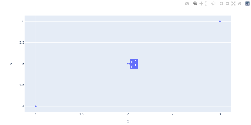
To initiate the enchantment, consider the basic syntax for a scatter plot:

06

Output:

The px.scatter function is the focal point for summoning a scatter plot. The parameters x and y dictate the positioning of data points along the respective axes.

  • Customizing Your Graph

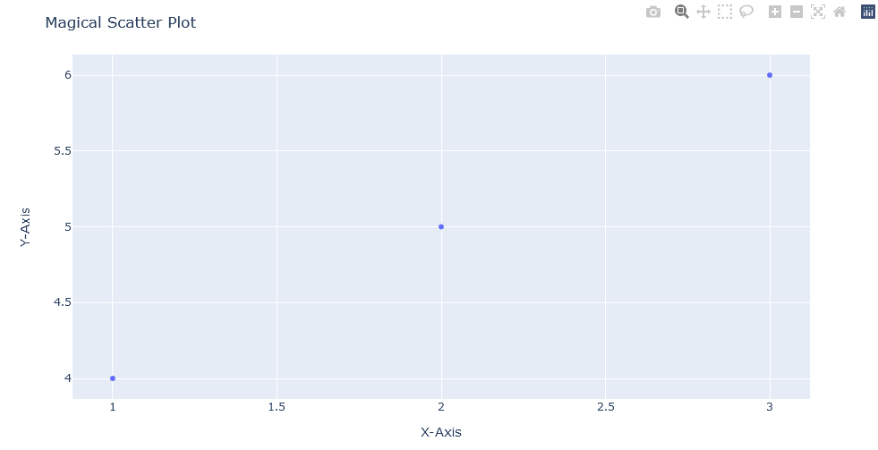
Plotly Express extends its capabilities to customization. Enhance your plot with titles and labels:

08
Output:

The update_layout function enables fine-tuning, allowing the addition of titles and labels for a more immersive experience.

  • Magical One-Liners with plotly.express

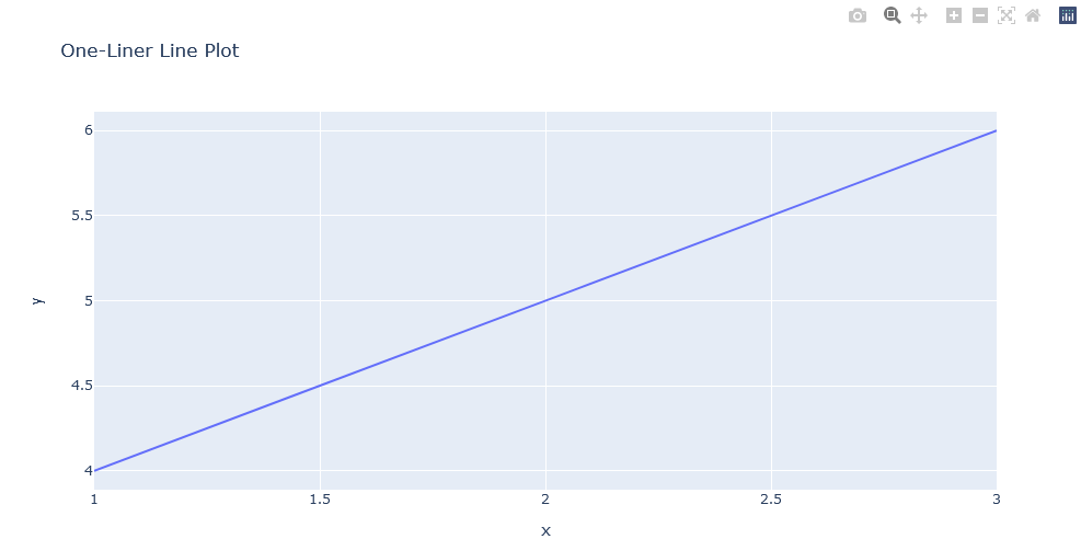
Plotly Express embraces brevity. Witness the power of one-liners:

10

Output:

With Plotly Express, complex plots become achievable in a concise, one-line command.

In essence, Plotly Express transforms the intricacies of plot creation into a seamless and artistic endeavor. As we continue our exploration, anticipate a deeper dive into Plotly Express, unraveling its diverse capabilities for crafting vivid and engaging visualizations.

Creating Interactive Line and Scatter Plots with Plotly Express

Welcome to the dynamic world of interactive plotting! In this section, we’ll dive into the art of crafting interactive line and scatter plots using the powerful Plotly Express library. Brace yourself for an engaging journey as we not only visualize data but also add a touch of interactivity with hover effects.

Building Interactive Line and Scatter Plots

Let’s kick off the magic show by creating interactive line and scatter plots that captivate your audience. With Plotly Express, this becomes a breeze:

12
Adding Interactivity with Hover Effects

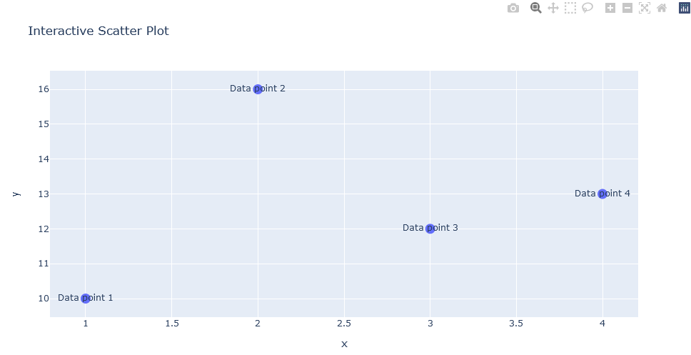
But wait, there’s more! Let’s elevate the interactive experience by adding hover effects. When you hover over data points, additional information magically appears:

13
Output:

The first section of our code enhances the scatter plot by adding hover effects. The update_traces method is used to modify the properties of the trace in the scatter plot (scatter_plot). The mode parameter is set to ‘markers+text’, indicating that both markers (data points) and text will be displayed upon hovering. The marker parameter further customizes the appearance of the markers, setting their size to 14. The text parameter specifies the text to be displayed when hovering over each point. In this case, it generates text like ‘Data point 1’, ‘Data point 2’, and so on, for each corresponding data point.

Similarly, the second section adds hover effects to the line plot. The update_traces method is used on the line plot (line_plot). The hoverinfo parameter is set to ‘y+name’, indicating that the hover information should display the y-axis value and the name of the trace. This means that when hovering over a point on the line plot, it will show the corresponding y-value and the name of the trace (in this case, the title ‘Interactive Line Plot’).

Finally, the last lines display the enhanced scatter plot and line plot with the added hover effects. Users can now experience the interactivity with the plots by hovering over data points and observing the customized hover information.

Bar Charts and Pie Charts with Plotly Express:

In this section, we’ll explore the art of creating dynamic bar charts and delightful pie charts using the versatile Plotly Express library. Get ready to dive into the world of visualization as we not only craft these charts but also learn to customize their appearance to make them uniquely yours.

Creating Bar Charts

Let’s kick off our exploration with the creation of interactive bar charts. Plotly Express simplifies the process, making it accessible with just a few lines of code:

15

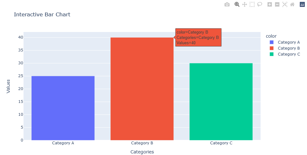
Output:

Explanation:

Let’s break down the provided code step by step:

  • The first line imports the Plotly Express library and assigns it the alias px. Plotly Express is a high-level interface for creating various types of interactive plots.
  • The second section creates an interactive bar chart using Plotly Express. The px.bar function is called with two arrays, x and y, representing the categories on the X-axis and the corresponding values on the Y-axis. The title parameter sets the chart title, and the labels parameter customizes the axis labels. The color parameter is used to differentiate categories by assigning different colors to each.

  • Finally, the last line displays the interactive bar chart. The show() method is called on the bar_chart object, rendering the chart in the output. Users can interact with the chart, explore the data, and hover over bars to view additional information.

Creating Pie Charts

Now, let’s venture into the realm of pie charts. Plotly Express makes it as simple as pie:

17
Output:

In this section, we are creating an interactive pie chart using Plotly Express. The px.pie function is called with two arrays, names and values, representing the categories and their corresponding values. The title parameter sets the chart title, and the labels parameter is used to customize the labels for clarity. In this case, ‘names’ is labeled as ‘Categories’, and ‘values’ is labeled as ‘Percentage’.

Customizing Appearance

Now, let’s add a touch of personalization to our visual creations. Customize the appearance of the bar chart with ease:

19

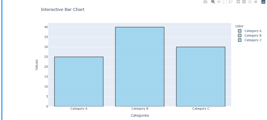
Output:

In this snippet, we’ve modified the appearance of the bar chart by changing the marker color, adding a marker line, adjusting its width, and setting opacity.

With Plotly Express, creating and customizing bar charts and pie charts becomes a delightful journey. Stay tuned as we continue our exploration of Plotly’s enchanting capabilities in the next section!

The Bottom Line

In this first part of our blog series, we’ve embarked on an enchanting journey into the world of Plotly Express, a powerful library that transforms data into captivating visual narratives. We began by introducing Plotly and its significance in data visualization, emphasizing its open-source nature and support for multiple programming languages.

Our exploration then delved into the installation and setup process, where we harnessed the magic of Plotly by installing it in Python. With a few simple commands, we unlocked the door to a realm of interactive visualizations.

Moving on, we stepped onto the stage of Plotly Express, unraveling its significance in simplifying plot creation. With Python as our linguistic palette, we created interactive scatter plots and line plots, adding an extra layer of magic with hover effects. The art of visual storytelling extended to bar charts and pie charts, where Plotly Express proved to be a master conductor, effortlessly crafting compelling visualizations.

As we conclude this initial part, we’ve laid the foundation for a deeper understanding of Plotly Express. The curtain has risen, revealing a world where data transcends mere numbers and transforms into an interactive symphony. In Part 2, we will continue our exploration, diving into more advanced features, intricate visualizations, and the nuanced art of customization. Stay tuned for the next act in our Plotly Express adventure, where the magic continues to unfold, If you enjoyed the blog follow 1stepgrow.